
Uncovering Hidden Clusters: Analyzing the Bureau of Customs Import Dataset
Published:
Executive Summary
The purpose of this report is to evaluate the potential benefits of incorporating a more innovative clustering technique in the import tax assessment process of the Philippine Bureau of Customs (BoC). The study was based on the Bureau of Customs import data collected from 2016-2022, consolidated using SQLlite3, and analyzed using the ‘GOODS_DESCRIPTION’ feature. The data was used to cluster Philippine importations from China, which is the largest importer in terms of dutiable value and tax payments during the specified period.
The results of the study indicated that the use of agglomerative clustering was an efficient solution for reducing and grouping the imported goods into 15 clusters. This solution outperformed the traditional method used by the agency, which has over a thousand sections and chapters for categorizing goods. The integration of innovative clustering techniques, such as agglomerative clustering, into the BoC’s assessment process could significantly enhance the efficiency and accuracy of the import tax assessment process.
In today’s rapidly changing global marketplace, it is imperative for organizations like the BoC to continuously seek new and innovative solutions that will improve their operational efficiency and effectiveness. The report recommends that the BoC consider the integration of innovative clustering techniques into their assessment process to stay ahead of the curve and provide better services to their stakeholders.
Problem Statement
With the aim of optimizing the assignment and classification of imported goods utilized by the Bureau of Customs, how might we leverage a more innovative clustering technique, either as a replacement or supplementary method, to the traditional divisions by sections and chapters?
Motivation
he Bureau of Customs is one of the government agencies under the Philippine Department of Finance. It is in charge of overseeing the country’s trade and customs when engaging in foreign commerce. Among its responsibilities are assessing and collecting customs revenues, i.e., monitoring and auditing[/taxing] the goods imported and exported across the country’s ports [of entry]. This bureau is also responsible for combating corruption, smuggling, and other forms of illegal trade and customs fraud. [1]
The BoC is lead by the Commissioner; assisted by six deputy commissioners, one assistant commissioner, and seventeen district collectors.[2] Senior-level agency leaders like the commissioner position are designated via presidential appointments. During the term (June 2016-June 2022) of the previous administration of Former President Rodrigo Roa Duterte (PRRD), the BoC experienced three changes in management initially headed by Former Marine Captain Nicanor Faeldon who assumed office on June 30, 2016. Isidro S. Lapeña started office on August 30, 2017 and finally followed by Retired General Rey Leonardo Guerrero of the Armed Forces of the Philippines on October 31, 2018 onwards until the end of the former country president’s term.
This study was conducted to answer the question, how did the changes in management at the BoC affect the importation over the previous administration’s 6-year term? It also aims to detect the abnormalities or differences in their customs process through their data.
Currently, the said agency is using conventional methods by categorizing the imported goods into sections and chapters. As their digitalization and automation efforts are being initiated, how can they take advantage of novel and innovative techniques to optimize their processes and therefore, enhance their operational efficiency and effectiveness.[3]
Methodology
This section describes the necessary steps taken by the team in order to answer the objective of the study,
| No. | Step | Description |
|---|---|---|
| 1. | Data extraction | Obtain Philippine Customs importation data from 2015 to 2022 for years 2015 and 2020 from jojie-collected public datasets (directory: /mnt/data/public) and store those in sqlite3 databases. |
| 2. | Data cleaning | Prepare, clean, and process the collected data accordingly to get the relevant data subsets and columns. |
| 3. | Data processing | Remove or add necessary columns for further analysis and create functions in preparation for data exploration. |
| 4. | Data Exploration | Provide a list of objectives and questions that would be explored, analyzed, and answered in the subsequent sections pertaining to trends, patterns, and insights regarding the Philippine Importation. |
| 5. | Dimension Reduction | Extract important features from the dataset using TF-IDF Vectorizer and reduce the number of components using Truncated Singular Value Decomposition (SVD) |
| 6. | Data Clustering | Perform clustering on the data using different methods such as agglomerative clustering (Ward’s Method), representative-based clustering (KMeans) and Density based clustering DBSCAN |
The detailed steps performed related to the above-presented methodology is presented in the Data Exploration and Results and Discussion sections of this document.
Data Source and Description
IMPORTATION DATA:
The source of the importation data is the Bureau of Customs’ website’s customs processing system called the E2M (Electronic-to-Mobile). It contains downloadable excel files that were scraped and made available to the team via the jojie-collected public datasets (directory: /mnt/data/public/customs) of the Asian Institute of Management (AIM).
The specific data used for this study includes all the monthly excel files from January 2015 to September 2022 which contain 33,293,684 rows and varying numbers of columns depending on the report available. Though there were more columns present in such files, only the following columns were used and considered relevant for this study:
| Column Name | Data Type | Short description |
|---|---|---|
| MONTH_YEAR | TEXT | Assessment month and year based on the filename |
| HS_CODE | TEXT | 11-digit Harmonized System (HS) code. This contains identification codes given to goods for use in international trade |
| COUNTRY_EXPORT | TEXT | Name of the Exporting Country |
| PREFERENTIAL_CODE | TEXT | Code used for preferential treatment of importation based on Free Trade Agreement |
| DUTIABLE_VALUE_FOREIGN | REAL | Financial value of the shipment based on invoice in foreign currency |
| CURRENCY | TEXT | Currency of the dutiable_value_foreign used by the importer |
| EXCHANGE_RATE | REAL | Exchange rate used to convert the foreign value to Philippine Peso |
| DUTIABLE_VALUE_PHP | REAL | Value of the shipment in Philippine Peso |
| DUTIES_AND_TAXES | REAL | System-calculated duties and taxes |
| EXCISE_ADVALOREM_PAID | REAL | System-calculated excise tax |
| VAT_BASE | REAL | The landed cost plus excise taxes, if any |
| VAT_PAID | REAL | System-calculated Value-Added Tax |
| NET_MASS_KGS | REAL | Net weight of the shipment in kilograms |
| GOODS_DESCRIPTION | TEXT | Description of the goods |
| CHAPTER | TEXT | Description of the HS Code |
Data Exploration
Import Libraries
# Import libraries
import pandas as pd
import numpy as np
from numpy import arange

import sqlite3
import pickle, joblib
import re
import os
from PIL import Image
import warnings

import matplotlib.pyplot as plt
import matplotlib.ticker as ticker
import plotly.express as px
import seaborn as sns

from pyclustering.cluster.kmedoids import kmedoids
from sklearn.feature_extraction.text import TfidfVectorizer
from sklearn.decomposition import PCA, TruncatedSVD

from wordcloud import WordCloud, STOPWORDS, ImageColorGenerator
from nltk.corpus import stopwords
from nltk.stem.snowball import SnowballStemmer
from nltk.stem import PorterStemmer, WordNetLemmatizer
from sklearn.cluster import (KMeans, AgglomerativeClustering, DBSCAN, OPTICS,
                             cluster_optics_dbscan)
from sklearn.neighbors import NearestNeighbors
from sklearn.metrics import (calinski_harabasz_score, silhouette_score,
                             davies_bouldin_score)
from sklearn.cluster import AgglomerativeClustering
from scipy.cluster.hierarchy import dendrogram
from fastcluster import linkage
from collections import defaultdict

c_blue = '#0038a8'
c_yellow = '#fcd116'
c_red = '#ce1126'
c_gray = '#9c9a9d'
c_black = '#000000'
c_green = '#3cb043'

pd.options.display.float_format = '{:,.2f}'.format
pd.set_option('display.max_rows', None)
pd.set_option('display.max_colwidth', None)
pd.set_option('mode.chained_assignment', None)

# plt.rcParams['font.family'] = 'sans-serif'
# plt.rcParams['font.sans-serif'] = 'DejaVu Sans'
plt.rcParams['axes.edgecolor'] = '#9c9a9d'
plt.rcParams['axes.linewidth'] = 0.8
plt.rcParams['xtick.color'] = c_black
plt.rcParams['ytick.color'] = c_black
plt.rcParams['grid.linewidth'] = 1
plt.rcParams["figure.figsize"] = (15, 10)
plt.rcParams['figure.dpi'] = 300

warnings.filterwarnings("ignore")
Utility Functions
@ticker.FuncFormatter
def billion_formatter(x, pos):
"""Returns formatted values in billions."""
return '{:,.1f} B'.format(x/1E9)
def trends_monthly():
"""Plot monthly trend based on dutiable value, duties & taxes, and
duties and taxes as percentage of dutiable value.
"""
# Plot overall monthly trend of duties and taxes over dutiable value
df_month = df_imports_agg.groupby('MONTH_YEAR').sum().reset_index()
df_month['DUTIES_AND_TAXES_PER_DUTIABLE_VALUE'] = \
df_month['SUM_DUTIES_AND_TAXES']*100/df_month['SUM_DUTIABLE_VALUE_PHP']
fig, ax = plt.subplots(figsize=(15, 8), dpi=200)
ax = sns.lineplot(data=df_month, x='MONTH_YEAR', y='SUM_DUTIABLE_VALUE_PHP',
color=c_blue)
sns.lineplot(data=df_month, x='MONTH_YEAR', y='SUM_DUTIES_AND_TAXES',
color=c_red, ax=ax)
title = 'Monthly trend of customs imports'
ax.set_title(title, fontsize=18, color=c_blue)
ax.set_ylabel('Trillion PHP', fontsize=14)
ax.set_xlabel('Year', fontsize=14)
# place a text box in upper left in axes coords
props = dict(boxstyle='round', facecolor='wheat', alpha=0.5)
textstr = f'Huge spikes in importation during these four months'
ax.text(0.05, 0.95, textstr, transform=ax.transAxes, fontsize=16,
verticalalignment='top', bbox=props)
peak_months = ['2016-11-01', '2017-07-01', '2019-03-01', '2020-07-01']
marks = df_month[df_month['MONTH_YEAR'].isin(peak_months)][['MONTH_YEAR',
'SUM_DUTIABLE_VALUE_PHP']]
marks.columns = ['MONTH_YEAR', 'SUM_DUTIABLE_VALUE_PHP']
marks.plot(x='MONTH_YEAR', y='SUM_DUTIABLE_VALUE_PHP',
legend=False, style='r*', ms=15, ax=ax)
for k, v in marks.iterrows():
ax.annotate(v[0].strftime('%Y-%b').upper(), v,
xytext=(10,-5), textcoords='offset points',
family='sans-serif', fontsize=12, color='darkslategrey')
# Legend
style = dict(size=12, color=c_blue)
ax.text('2015-02', 0.48e12, 'TOTAL DUTIABLE VALUE', ha='left', **style)
style = dict(size=12, color=c_red)
ax.text('2015-02', 0.08e12, 'TOTAL DUTIES AND TAXES', ha='left', **style)
ax.axhline(y=0.7e12, color=c_green, linestyle='--')
plt.show()
def yearly_top15_countries_dv():
"""Returns a plot of yearly top 15 countries by dutiable value."""
sql = """
SELECT MONTH_YEAR,
COUNTRY_EXPORT,
SUM(SUM_DUTIABLE_VALUE_PHP) as SUM_DUTIABLE_VALUE_PHP,
SUM(SUM_DUTIES_AND_TAXES) as SUM_DUTIES_AND_TAXES
FROM summary_year_cntry
GROUP BY MONTH_YEAR, COUNTRY_EXPORT
"""
try:
with open('pickles/df_summary_year_cntry.pkl', 'rb') as f:
df_summary_year_cntry = joblib.load(f)
except:
df_summary_year_cntry = pd.read_sql(sql, conn)
df_summary_year_cntry['MONTH_YEAR'] = (pd.to_datetime(
df_summary_year_cntry['MONTH_YEAR'], format='%Y-%m'))
with open(f'pickles/df_summary_year_cntry.pkl', 'wb') as f:
joblib.dump(df_summary_year_cntry, f)
# Plot top countries by dutiable value
topn = 100
topn_highest = (df_summary_year_cntry.groupby(
[pd.Grouper(key='MONTH_YEAR', freq='Y'),
'COUNTRY_EXPORT'])
.sum()
.nlargest(topn, 'SUM_DUTIABLE_VALUE_PHP'))
topn_highest_yr_cntry = topn_highest.sort_index().reset_index()
top_countries = topn_highest_yr_cntry['COUNTRY_EXPORT'].unique().tolist()
paramlist = r'?'
for i in range(1, len(top_countries)):
paramlist = paramlist + r', ?'
sql = f"""
SELECT substr(month_year,1,4) as YR,
country_export,
sum(SUM_DUTIABLE_VALUE_PHP) as SUM_DUTIABLE_VALUE_PHP,
sum(SUM_DUTIES_AND_TAXES) as SUM_DUTIES_AND_TAXES,
sum(SUM_NET_MASS_KGS) as SUM_NET_MASS_KGS
FROM summary_year_cntry
WHERE country_export in ({paramlist})
GROUP BY YR, country_export
"""
try:
with open('pickles/top_countries_per_yr.pkl', 'rb') as f:
top_countries_per_yr = joblib.load(f)
except:
top_countries_per_yr = pd.read_sql(sql, conn, params=top_countries)
with open(f'pickles/top_countries_per_yr.pkl', 'wb') as f:
joblib.dump(top_countries_per_yr, f)
df_top_cntry_pvt = (top_countries_per_yr.pivot(
values='SUM_DUTIABLE_VALUE_PHP',
index='YR',
columns='COUNTRY_EXPORT'))
# Plot
fig, ax = plt.subplots(figsize=(10, 5), dpi=200)
list_exclude = ['CHINA']
list_cntry = [c for c in top_countries if c not in list_exclude]
palette = {c:'red' if c=='CHINA' else 'grey' for c in top_countries}
ax = sns.lineplot(data=df_top_cntry_pvt, dashes=False,
palette=palette, lw=2)
ax.get_legend().remove()
style = dict(size=10, color=c_red)
ax.text('2015', 550e9, 'CHINA', ha='center',
**style)
ax.yaxis.set_major_formatter(billion_formatter)
ax.set_xlabel('YEAR')
ax.set_ylabel('DUTIABLE VALUE (in Billions PHP)')
# place a text box in upper left in axes coords
props = dict(boxstyle='round', facecolor='wheat', alpha=0.5)
textstr = f"CHINA importations consistently above all other\ncountries from 2015 to 2022."
ax.text(0.05, 0.95, textstr, transform=ax.transAxes, fontsize=10,
verticalalignment='top', bbox=props)
plt.show()
def top_countries():
"""Returns plots of top 10 countries by dutiable value and by
duties and taxes."""
# Create data frames for top 10 by country_export
sql = """
SELECT *
FROM summary_year_cntry
"""
try:
with open('pickles/df_imports_agg_by_yr_cntry.pkl', 'rb') as f:
df_imports_agg_by_yr_cntry = joblib.load(f)
except:
df_imports_agg_by_yr_cntry = pd.read_sql(sql, conn)
with open(f'pickles/df_imports_agg_by_yr_cntry.pkl', 'wb') as f:
joblib.dump(df_imports_agg_by_yr_cntry, f)
n = 10
SDV_top10 = (df_imports_agg_by_yr_cntry
.groupby(['COUNTRY_EXPORT'])['SUM_DUTIABLE_VALUE_PHP']
.sum().sort_values(ascending=False)[:n].reset_index())
n = 10
SDT_top10 = (df_imports_agg_by_yr_cntry
.groupby(['COUNTRY_EXPORT'])['SUM_DUTIES_AND_TAXES']
.sum().sort_values(ascending=False)[:n].reset_index())
# Plot based on Dutiable Value
y = SDV_top10['SUM_DUTIABLE_VALUE_PHP']/1e12
x = SDV_top10['COUNTRY_EXPORT']
fig, ax = plt.subplots(figsize=(10, 5), dpi=200)
ax.barh(x, y, color=['#0038a8', 'lightgray', 'lightgray', 'lightgray',
'lightgray', 'lightgray', 'lightgray', 'lightgray',
'lightgray', 'lightgray'])
ax.invert_yaxis()
ax.set_xlabel('Dutiable value in trillion PHP')
ax.set_title("China is the top country based on dutiable value "
"from 2015-2022")
ax.yaxis.set_label_position("right")
ax.yaxis.tick_right()
plt.show()
fig_caption(f'Dutiable Values of Foreign Importations from 2015 to 2022', 'China is the top country based on dutiable value from 2015-2022')
# Plot based on duties and taxes
y = SDT_top10['SUM_DUTIES_AND_TAXES']/1e12
x = SDT_top10['COUNTRY_EXPORT']
fig, ax = plt.subplots(figsize=(10, 5), dpi=200)
ax.barh(x, y, color=['#0038a8', 'lightgray', 'lightgray', 'lightgray',
'lightgray', 'lightgray', 'lightgray', 'lightgray',
'lightgray', 'lightgray'])
ax.invert_yaxis()
ax.set_xlabel('Duties and taxes in trillion PHP')
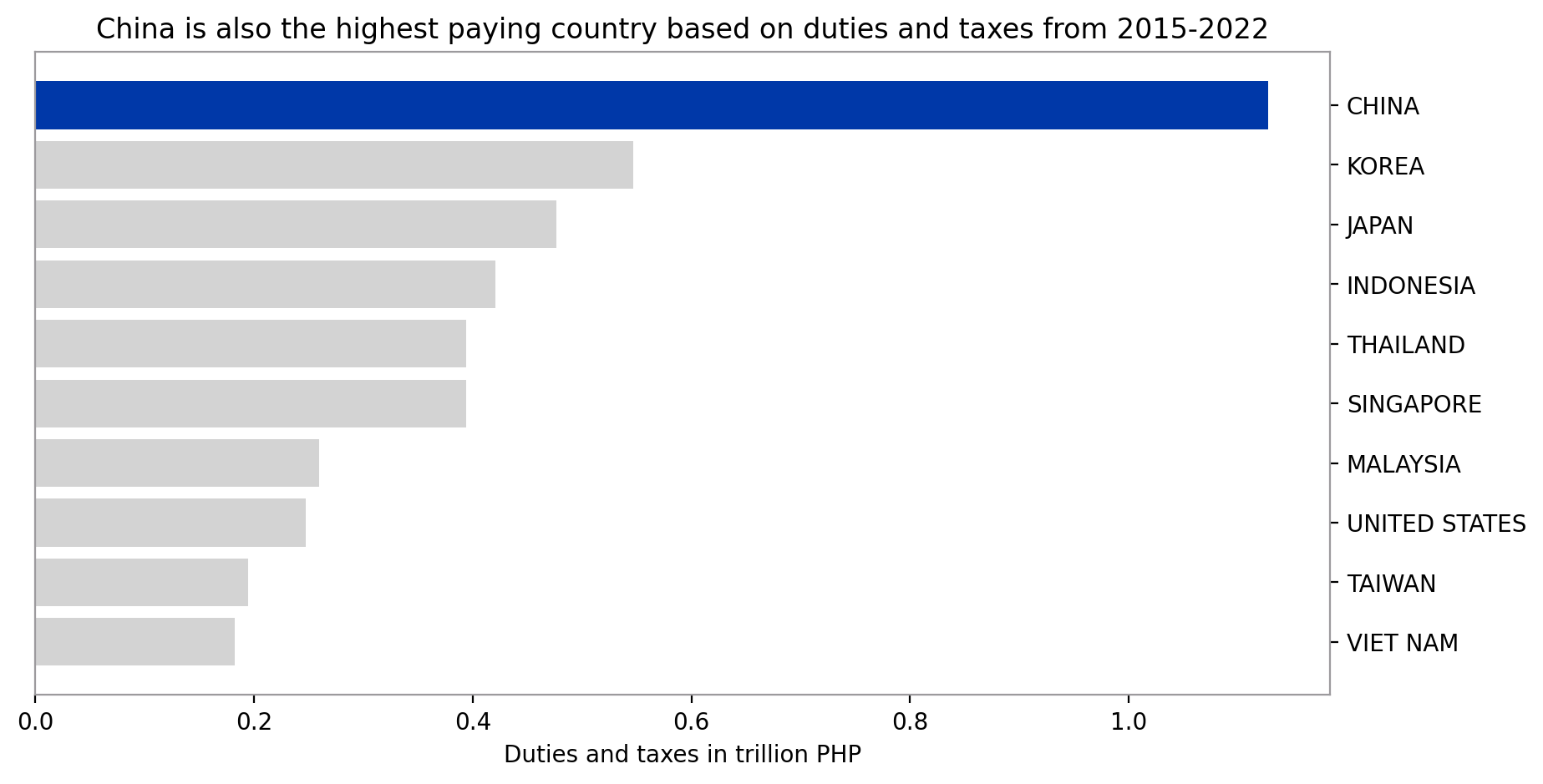
ax.set_title("China is also the highest paying country based on duties and "
"taxes from 2015-2022")
ax.yaxis.set_label_position("right")
ax.yaxis.tick_right()
plt.show()
fig_caption(f'Duties and Taxes of Foreign Importations from 2015 to 2022', 'China is also the highest-paying country based on duties and taxes from 2015-2022')
# Show amount & % to total of DV and DT during PRRD's Term
total_SDV = df_imports_agg_by_yr_cntry['SUM_DUTIABLE_VALUE_PHP'].sum()
total_SDT = df_imports_agg_by_yr_cntry['SUM_DUTIES_AND_TAXES'].sum()
print(
f"sum of dutiable value (2015-2022) = {total_SDV/1e12:,.2f} trillion")
print(
f"sum of duties and taxes (2015-2022) = {total_SDT/1e12:,.2f} trillion")
SDV_top10['% OF TOTAL'] = (
SDV_top10['SUM_DUTIABLE_VALUE_PHP']/total_SDV)*100
display(SDV_top10)
fig_caption(f'Dutiable Values Table', 'Top 10 Countries based on Dutiable Values')
SDT_top10['% OF TOTAL'] = (SDT_top10['SUM_DUTIES_AND_TAXES']/total_SDT)*100
display(SDT_top10)
fig_caption(f'Duties and Taxes Table', 'Top 10 Countries based on Duties and Taxes')
def top_chapters():
"""Returns plots of the top 10 and bottom 5 chapters during PRRD's Term.
"""
# Plot Top 10 Chapters using a bar graph based on dutiable value
# Create a df containing importation data during PRRD's term
# Save the top & bottom chapters by dutiable value & duties & taxes in PHP
n = 10
df_topn_dv = (df_chapters.groupby(['HSCODE_2', 'CHAPTER'])
['SUM_DUTIABLE_VALUE_PHP']
.sum()
.sort_values(ascending=False)[:n]
.reset_index())
n = 5
df_botn_dv = (df_chapters.groupby(['HSCODE_2', 'CHAPTER'])
['SUM_DUTIABLE_VALUE_PHP']
.sum().sort_values(ascending=True)[:n].reset_index())
# Set labels
label_top_dv = ('Electrical machinery \nand equipment',
'Nuclear reactors, boilers',
'Mineral fuels, mineral oils',
'Iron and steel',
'Articles of iron and steel',
'Plastics and articles thereof',
'Vehicles other than railway \nor tramway rolling-stock',
'Ceramic products',
'Furniture; bedding, mattresses;\n lamps and lighting fittings',
'Optical, photographic, \ncinematographic')
# Based on dutiable value
x = df_topn_dv['CHAPTER']
y = df_topn_dv['SUM_DUTIABLE_VALUE_PHP']/1e12
font1 = {'family': 'serif', 'color': c_blue}
fig, ax = plt.subplots(figsize=(15, 10), dpi=200)
fig.suptitle("Top 10 Chapters of Goods Imported from CHINA",
fontsize=24, fontdict=font1)
# Top 10 chapters based on dutiable value
ax.barh(x, y, color=[c_blue, c_yellow, 'lightgray', 'lightgray',
'lightgray', 'lightgray', 'lightgray', 'lightgray',
'lightgray', 'lightgray'], tick_label=label_top_dv)
ax.invert_yaxis() # labels read top-to-bottom
ax.set_xlabel('Dutiable Value in Trillion PHP', fontsize=16)
ax.set_title("based on Dutiable Value (2015 to 2022)",
fontsize=20, color=c_blue)
ax.yaxis.set_label_position("right")
ax.tick_params(axis='x', labelsize=16)
ax.tick_params(axis='y', labelsize=16)
ax.yaxis.tick_right()
plt.show()
fig_caption(f'Top 10 Chapters of Goods Imported from China', 'Electronic machinery and equipments was the top chapter of goods imported followed by nuclear reactors, boilers')
# Plot bottom chapters
# Based on dutiable value
x = df_botn_dv['CHAPTER']
y = df_botn_dv['SUM_DUTIABLE_VALUE_PHP']/1e9
label_bot_dv = ['Meat and edible meat offal',
'Products of animal origin',
'Vegetable plaiting materials',
'Live trees and other plants',
'Live animals']
font1 = {'family': 'serif', 'color': c_red}
fig, ax = plt.subplots(figsize=(15, 10), dpi=200)
fig.suptitle('Bottom 5 Chapters of Goods Imported from CHINA (2015-2022)',
fontsize=24, fontdict=font1)
# Bottom 5 chapters based on dutiable value
ax.barh(x, y, color=[c_yellow, c_yellow, 'lightgray', 'lightgray',
'lightgray'], tick_label=label_bot_dv)
ax.invert_yaxis() # labels read top-to-bottom
ax.set_xlabel('Dutiable value in billion PHP', fontsize=16, color=c_red)
ax.set_title('based on Dutiable Value (2015 to 2022)',
fontsize=20, color=c_red)
ax.yaxis.set_label_position("right")
ax.tick_params(axis='x', labelsize=16)
ax.tick_params(axis='y', labelsize=16)
ax.yaxis.tick_right()
plt.show()
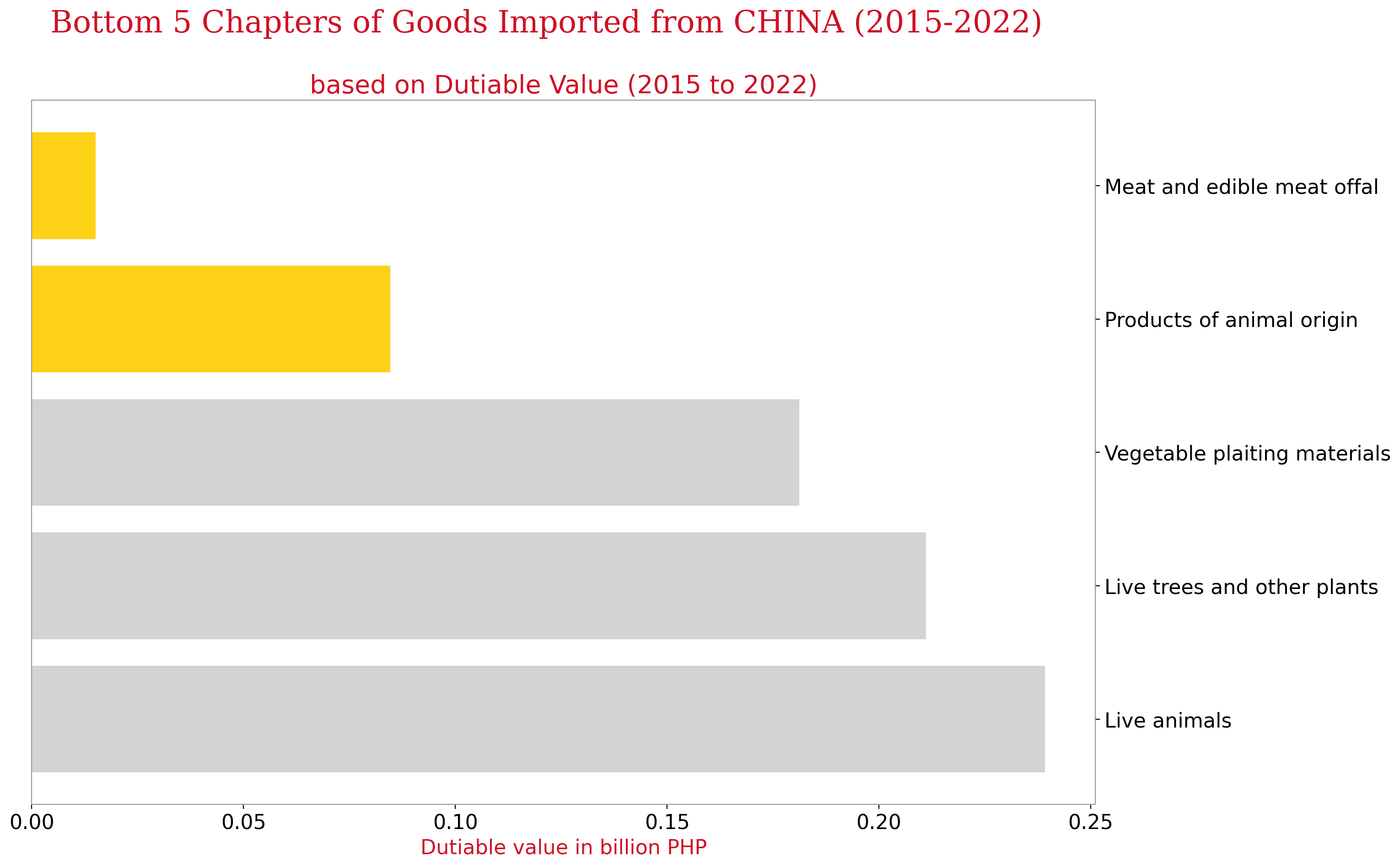
fig_caption(f'Bottom 5 Chapters of Goods Imported from China', 'Among the lowest number of imported goods were under the meat and edible meat ofal classification as well as products of animal origin.')
def clean_text(text, stop_words, lemmatizer):
# Convert the text to lowercase
text = text.casefold()
# Compile word pattern
word_pattern = re.compile(r'\b[a-z\-]+\b')
# Remove stopwords and lemmatize words
text_list = [
lemmatizer.lemmatize(word)
for word in word_pattern.findall(text)
if word not in stop_words
]
# Join words to form cleaned text
return ' '.join(text_list)
# Create set of stopwords
stop_words = frozenset(stopwords.words('english') + [
'pkg', 'pkgs', 'packages', 'ctn', 'ctns', 'pc', 'pcs',
'p', 'n', 'lady men', 'stc', 'x', 'men', 'women', 'lady', 'kid',
'adult', 'boy', 'girl', 'said', 'contain', 'pkgs mic', 'piece',
'- -','brand', 'pieces', 'ctns', 'cn-made'
] + list(STOPWORDS))
# Initialize lemmatizer
lemmatizer = WordNetLemmatizer()
# Counter for figure numbers
fig_num = 1
# Function to format figure captions
def fig_caption(title, caption):
global fig_num
display(HTML(f"""<p style="font-size:11px;font-style:default;"><b>
Figure {fig_num}. {title}.</b><br>{caption}</p>"""))
fig_num += 1
# Define year_list and months
year_list = ['2016-11','2015-11','2017-7','2016-7','2019-3','2018-3','2020-7', '2019-7']
months = ['one', 'two', 'three', 'four' , 'five' , 'six' , 'seven' , 'eight']
# Define SQL query
sql = """
SELECT MONTH_YEAR,
COUNTRY_EXPORT,
PREFERENTIAL_CODE,
GOODS_DESCRIPTION
FROM imports
WHERE COUNTRY_EXPORT = ?
AND GOODS_DESCRIPTION IS NOT NULL
AND MONTH_YEAR = ?
"""
# Check if the pickle file already exists
for names, i in enumerate(year_list):
try:
with open(f'pickles/corpus_china_{i}.pkl', 'rb') as f:
corpus_china_ = pickle.load(f)
except:
# Read data from SQL database and save as dataframe
df_china = pd.read_sql(sql, conn, params=('CHINA', i))
with open(f'pickles/df_china_{i}.pkl', 'wb') as f:
df_china.to_pickle(f)
# Clean the text and fit to TfidfVectorizer
df_china['GOODS_DESCRIPTION'] = df_china['GOODS_DESCRIPTION'].apply(lambda x: clean_text(x, stop_words, lemmatizer))
tfidf_vectorizer = TfidfVectorizer(token_pattern=r'[a-z-]+',
stop_words='english',
ngram_range=(2, 2),
min_df=.001)
corpus_china = tfidf_vectorizer.fit_transform(df_china['GOODS_DESCRIPTION'])
corpus_labels = tfidf_vectorizer.get_feature_names_out()
corpus_data = corpus_china[corpus_china.sum(axis=1).nonzero()[0]].toarray()
# Create a dataframe from the corpus data
df_data = pd.DataFrame(corpus_data, columns=corpus_labels)
# Save the data to pickle files
with open(f'pickles/corpus_china_{i}.pkl', 'wb') as f:
pickle.dump(corpus_data, f)
with open(f'pickles/df_data_{i}.pkl', 'wb') as f:
pickle.dump(df_data, f)
for i, year in enumerate(year_list):
# Set the file path for the svd data
file_path = f'pickles/china_svd_new_{year}.pkl'
try:
# Attempt to open and load the svd data from the file
with open(file_path, 'rb') as f:
china_svd_new = pickle.load(f)
except:
# If the file does not exist or there is an error opening it, calculate the svd
corpus_file_path = f'pickles/corpus_china_{year}.pkl'
with open(corpus_file_path, 'rb') as f:
# Load the corpus data
corpus_data = pickle.load(f)
# Perform TruncatedSVD on the corpus data
svd = TruncatedSVD(n_components=corpus_data.shape[1], random_state=10053)
china_svd = svd.fit_transform(corpus_data)
# Calculate the explained variance ratio
var_exp = svd.explained_variance_ratio_
# Find the number of singular values that result in at least 80% of explained variance
n_sv = np.argmax(var_exp.cumsum() >= 0.8) + 1
print(f"The minimum number of SVs to get at least 80% of explained variance is {n_sv}.")
# Perform TruncatedSVD with the minimum number of singular values
china_svd_new = TruncatedSVD(n_components=n_sv, random_state=10053).fit_transform(corpus_data)
# Save the svd data to the file
with open(file_path, 'wb') as f:
pickle.dump(china_svd_new, f)
Data Extraction
The customs datasets were obtained via a public dataset. The raw data are all in xlsx file format which were saved to pickle files and sqlite3 databases. The detailed steps performed, including the relevant documents used and created are documented below:
- Step 1: Obtained the monthly importation excel files from 2015 to 2022 and saved those datasets to their respective yearly pickle files.
| Jupyter Notebooks | Pickle Files created |
|---|---|
| customs-sqllite-2015.ipynb | 2015_imports.pkl |
| customs-sqllite-2016.ipynb | 2016_imports.pkl |
| customs-sqllite-2017.ipynb | 2017_imports.pkl |
| customs-sqllite-2018.ipynb | 2018_imports.pkl |
| customs-sqllite-2019.ipynb | 2019_imports.pkl |
| customs-sqllite-2020.ipynb | 2020_imports.pkl |
| customs-sqllite-2021.ipynb | 2021_imports.pkl |
| customs-sqllite-2022.ipynb | 2022_imports.pkl |
- Step 2: Used the yearly ‘-imports.pkl’ files to extract all the column names from the customs files and created a dictionary to map those extracted names to a standard column naming convention.
| Jupyter Notebook | Excel File created |
|---|---|
| colname_extraction.ipynb | Column_Dict.xlsx |
- Step 3: Used the yearly ‘-imports.pkl’ files from step 1 to create relevant tables and insert values in each year’s ‘-customs.db’
| Jupyter Notebooks | SQLite3 Databases created |
|---|---|
| customs-create-sqllite-2015.ipynb | 2015-customs.db |
| customs-create-sqllite-2016.ipynb | 2016-customs.db |
| customs-create-sqllite-2017.ipynb | 2017-customs.db |
| customs-create-sqllite-2018.ipynb | 2018-customs.db |
| customs-create-sqllite-2019.ipynb | 2019-customs.db |
| customs-create-sqllite-2020.ipynb | 2020-customs.db |
| customs-create-sqllite-2021.ipynb | 2021-customs.db |
| customs-create-sqllite-2022.ipynb | 2022-customs.db |
- Step 4: Obtained the census excel file for 2020 (includes 2015 population) and saved such file to ‘census.db’ database.
| Jupyter Notebook | SQLite3 database created | Excel file created |
|---|---|---|
| census-create-sqllite.ipynb | census.db | census.xlsx |
- Step 5: Combined the yearly imports database contents, created in step 3, into a single database named ‘imports_combined.db’
| Jupyter Notebook | SQLite3 database created | Excel file created |
|---|---|---|
| imports_combined.ipynb | imports_combined.db | imports_rowcounts.xlsx |
Step 6: Inserted Reference Tables (Reference-Tables.ipynb) to ‘imports_combined.db’ database.
Step 7: Place the above files in the same directory.
Data Cleaning and Processing
Customs Importation Data
try:
    with open('pickles/df_imports_agg.pkl', 'rb') as f:
        df_imports_agg = joblib.load(f)
except:
    sql = """
    SELECT MONTH_YEAR,
           SUM(DUTIABLE_VALUE_PHP) as SUM_DUTIABLE_VALUE_PHP,
           SUM(DUTIES_AND_TAXES) as SUM_DUTIES_AND_TAXES
    FROM imports
    GROUP BY MONTH_YEAR
    """

    df_imports_agg = pd.read_sql(sql, conn)
    df_imports_agg['MONTH_YEAR'] = (pd.to_datetime(
        df_imports_agg['MONTH_YEAR'], format='%Y-%m'))
    df_imports_agg.head()
    with open(f'pickles/df_imports_agg.pkl', 'wb') as f:
        joblib.dump(df_imports_agg, f)

try:
#     with open('pickles/imports_by_chapters.pkl', 'rb') as f:
    with open('pickles/china_by_chapters.pkl', 'rb') as f:
        df_chapters = joblib.load(f)
except:
    sql = """
    SELECT substr(substr('0000000000'||i.HS_CODE, -11, 11), 1, 2) as HSCODE_2,
           c.CHAPTER,
           SUM(i.DUTIABLE_VALUE_PHP) as SUM_DUTIABLE_VALUE_PHP,
           SUM(i.DUTIES_AND_TAXES) as SUM_DUTIES_AND_TAXES
    FROM imports i, chapters c
    WHERE substr(substr('0000000000'||i.HS_CODE, -11, 11), 1, 2) = c.HSCODE_2
    AND  COUNTRY_EXPORT = 'CHINA'
    GROUP BY 1,2
    """

    df_chapters = pd.read_sql(sql, conn)
#     with open(f'pickles/imports_by_chapters.pkl', 'wb') as f:
    with open(f'pickles/china_by_chapters.pkl', 'wb') as f:
        joblib.dump(df_chapters, f)
Exploratory Data Analysis (EDA)
OBJECTIVE:
The objective of this EDA is to identify which subset of the data we can focus on considering that the full dataset is too big for JOJIE or our laptops to handle.
QUESTIONS:
1. What is the trend involving Philippine importation from 2015 to 2022?
2. Which countries dominate the Philippine importation scene?
3. Which chapters dominate the Philippine importation scene? Which chapters are weak?
Monthly trend based on dutiable value and duties and taxes
trends_monthly()
fig_caption(f'Customs Imports Monthly Trend', 'The huge spikes in importation from 2015 to 2022')
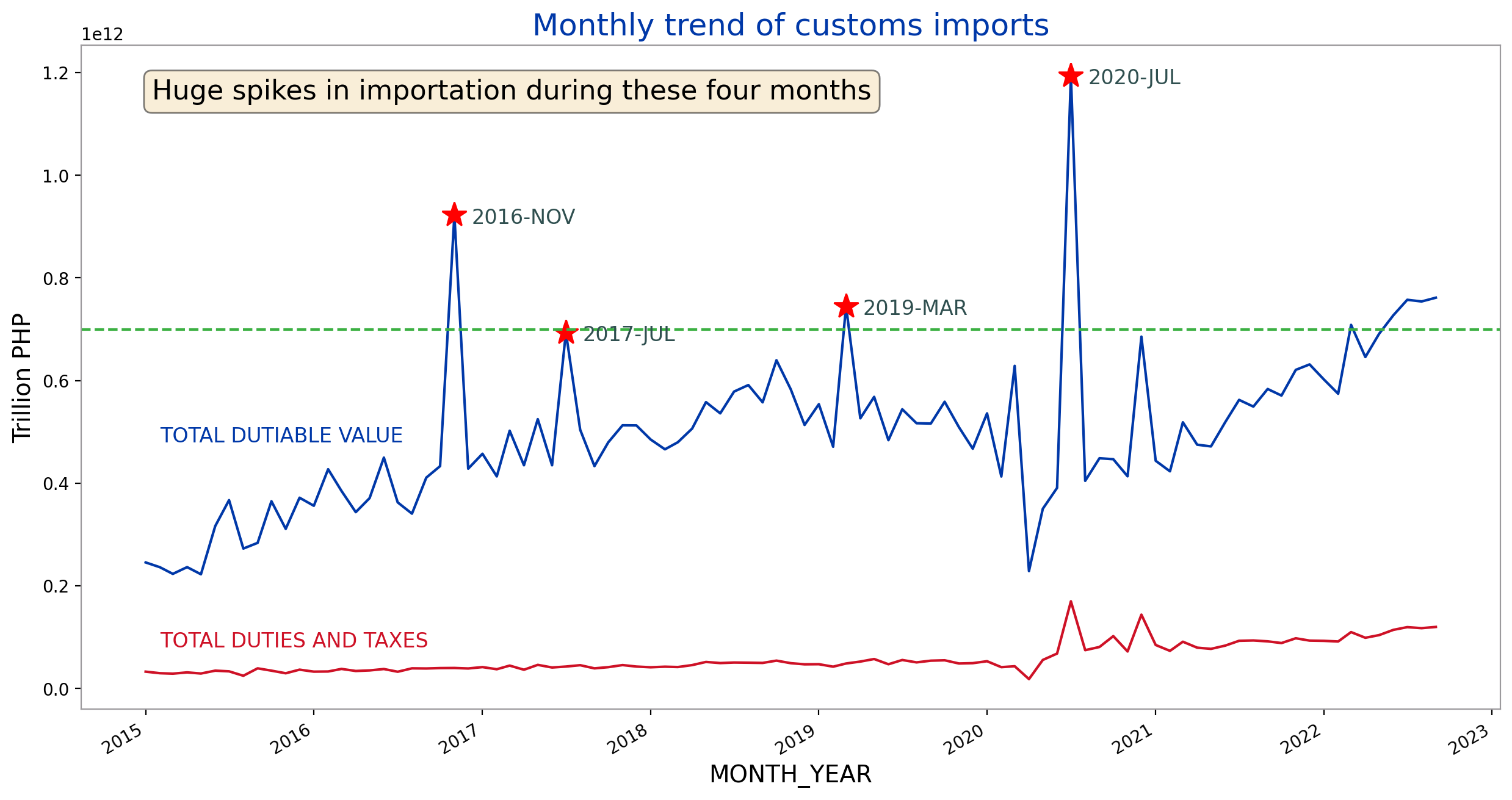
There’s an increasing trend in dutiable value through the years from 2015 to 2022. There’s a huge dip in March 2020 caused by the 2-week lockdown set by the government. However, after that the monthly total dutiable values of imports had been steadily increasing.
Upon inspection of the data, the sudden peak in total importation values can be attributed to electronics, specifically laptops. This was the time when offices were shifting to a work-from-home setup and some schools enforced online learning.
For the last 4 months (June-Sept 2022), the monthly dutiable value was above 700 billion PHP. This threshold has only been surpassed four other times before (Nov 2016, March 2019, July 2020, and March 2022).
We can notice four large spikes in the dutiable values corresponding to the months of November 2016, July 2017, March 2019 and July 2020. However, these spikes did not translate to increases in total duties and taxes during these months. This means that the items that caused the spikes had tax exemptions.
We will focus on these four months to cluster the importations based on the goods description.
Top Countries Exporting to the Philippines from 2015-2022
yearly_top15_countries_dv()
fig_caption(f'Dutiable value per Year', 'The dutiable value of China consistently remained number 1 among other countries.')
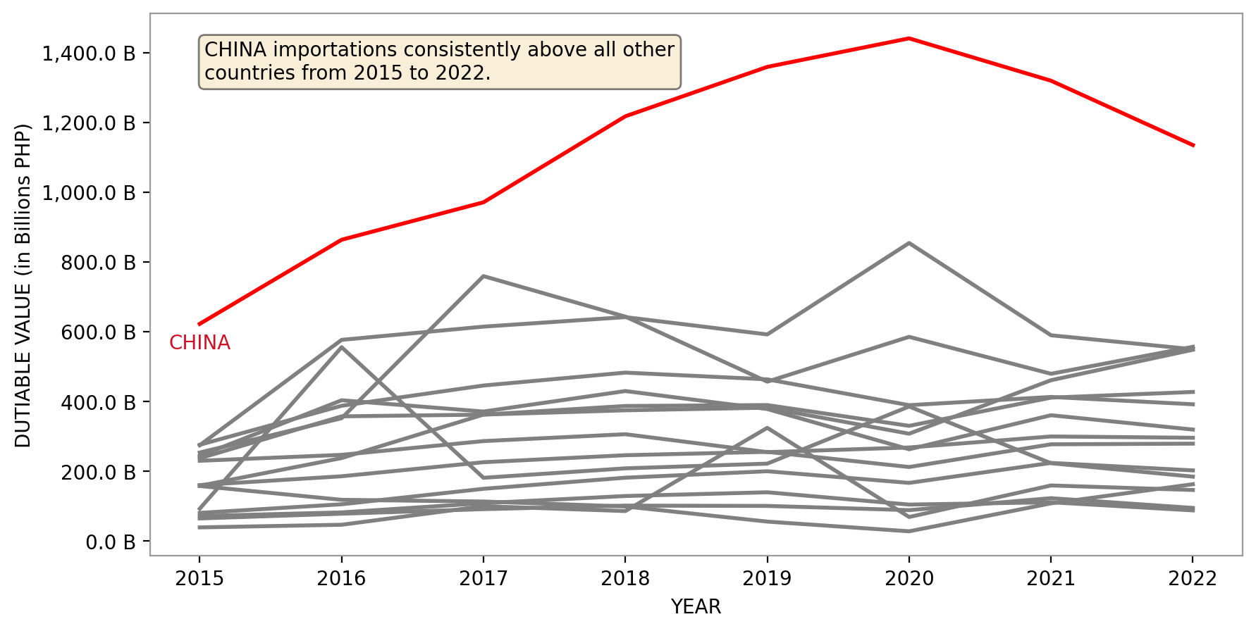
The above chart shows that the dutiable value of CHINA importations grew consistently from 2016 to 2020 but started decreasing slightly from 2021 onwards. It has remained the top importing country since 2016. It breached the 1 trillion PHP mark in 2018.
Since CHINA is the run-away winner in terms of total dutiable value, we will focus to cluster the goods imported from CHINA and see if we can uncover patterns.
top_countries()
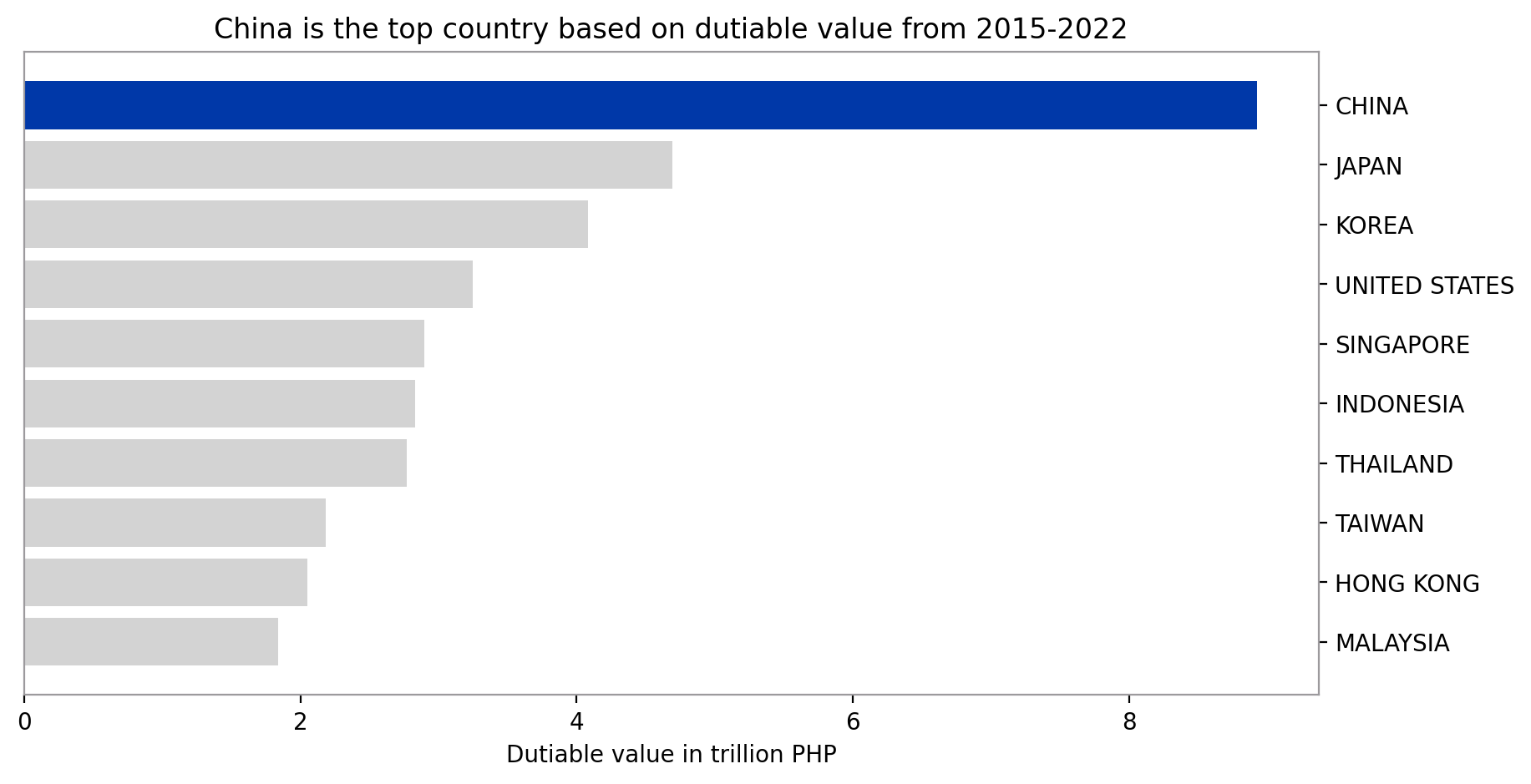
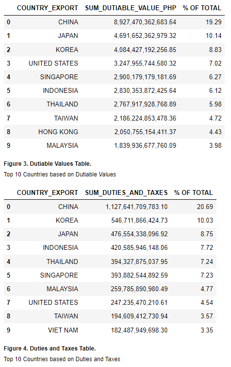
Except for the United States, 9 out of the 10 countries with the highest dutiable value when it comes to imports are Asian countries. 4 out of these belong to ASEAN countries. These top 10 countries amounted to 77.31% of the total dutiable value imported from 2015 to 2022. Lastly, China is the biggest importer in terms of dutiable value which amounted to 19.59% of the total.
Similar to dutiable values, 9 out of the 10 countries with highest duties and taxes from importing are Asian countries except for the US. 5 out of these also belong to the ASEAN countries. The top 10 countries contributed 78.53% of the total duties and taxes from imports for the period 2015 to 2022. Similarly, China is the highest tax payer which was assessed to have 21.95% of the total duties and taxes from imports.
Top Chapters of Goods Imported
Harmonized System Codes (HS Codes) are a standardized international classification system used to identify goods in international trade. It is a multi-purpose commodity description and coding system that assigns a unique code to every product traded internationally. The HS Codes are used by customs authorities worldwide to monitor and regulate the import and export of goods. The HS system provides a uniform basis for the collection of customs duties and taxes, as well as statistical information on trade. The HS Codes are maintained by the World Customs Organization (WCO) and are updated periodically to reflect changes in the world economy and trade patterns.
The member countries of the Association of Southeast Asian Nations (ASEAN), which the Philippines belong to, use the ASEAN Harmonized Tariff Nomenclature (AHTN) to classify goods for the purpose of trade and customs. The AHTN is based on the HS (Harmonized System) of product classification, but has been modified to take into account the specific requirements and trade patterns of ASEAN member countries. The AHTN provides a common set of product codes and definitions that are used by ASEAN member countries to determine the tariffs and other trade measures that apply to imported goods. The use of the AHTN helps to simplify trade and reduce the costs associated with customs procedures, making it easier for businesses to trade within the ASEAN region.
Both HS Codes and ATHN are grouped into 21 Sections and 97 Chapters. Consequently, the Bureau of Customs divide the custom examiners and appraisers into these Sections and assigns the goods accordingly for customs processing.
Let’s take a look at the top Chapters contributing to the total importations from 2015 to 2022.
top_chapters()
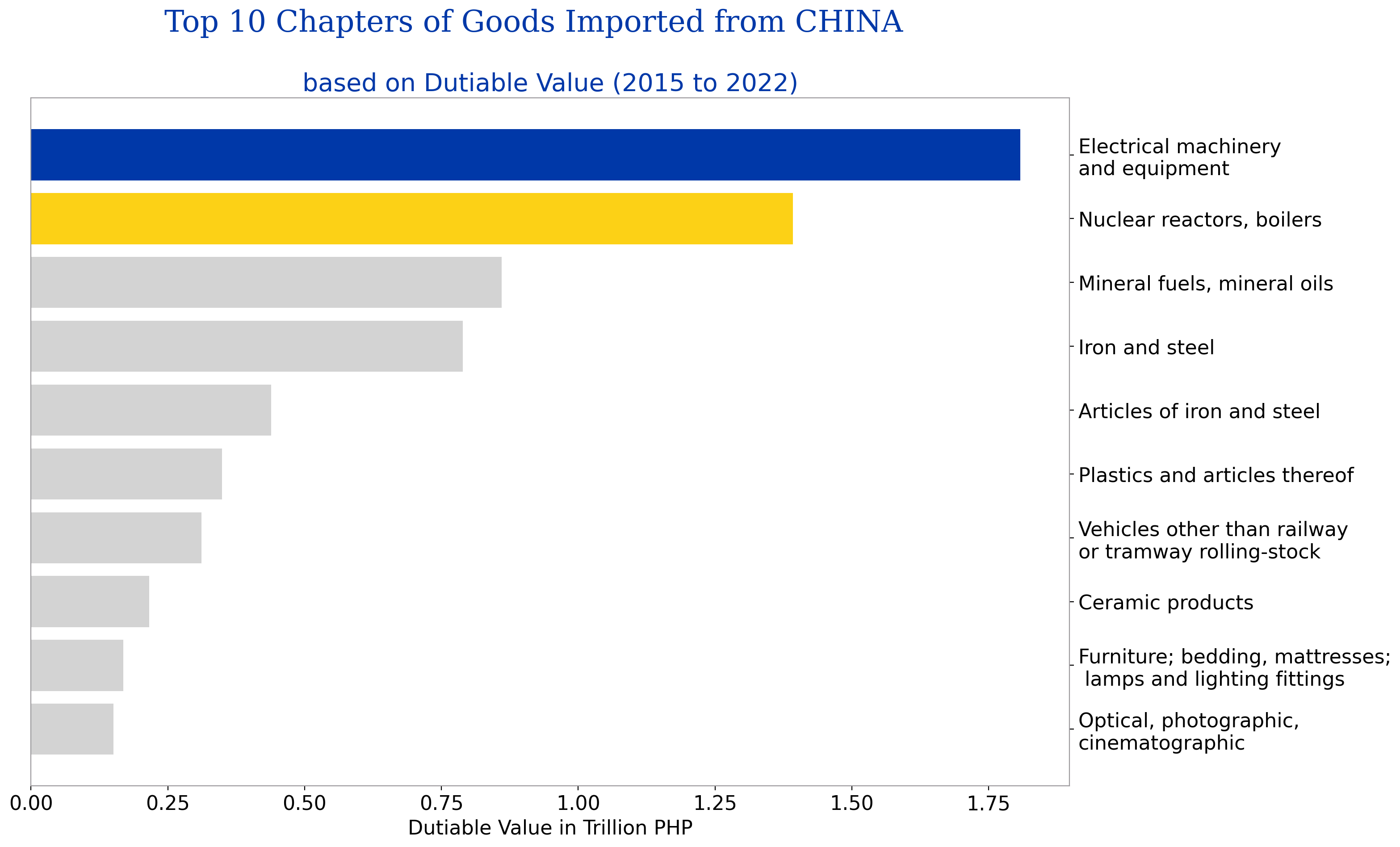
Grouping the imported goods from China by HSCODE or AHTN code, the above graph shows the top 10 chapters based on dutiable value. Almost 70% of the total dutiable value of the goods from China for the years 2015 to 2022 came from these top 10 chapters.
Goods belonging to Chapters 85 and 84 are the top 1 and 2, respectively. These goods are electrical machinery and equipment and parts thereof; sound recorders and reproducers, television image and sound recorders and reproducers and parts and accessories of such articles and nuclear reactors, boilers, machinery and mechanical appliances and parts thereof.
According to DTI’s Trade Statistics website, electronic machinery and equipment is also the Philippines’ top 1 export product with at least 53% of total exports over the last five years.
On the other hand, meat and edible meat offal and products of animal origin are the least imported goods from China. Vegetable plaiting belonged to the least imported product based on dutiable value.
Importation of live animals and plants is highly regulated and requires permits and clearances from the Bureau of Animal Industry and Bureau of Plant Industry, so it makes sense to be part of the bottom chapters that the Philippines imports from China.
Results and Discussions
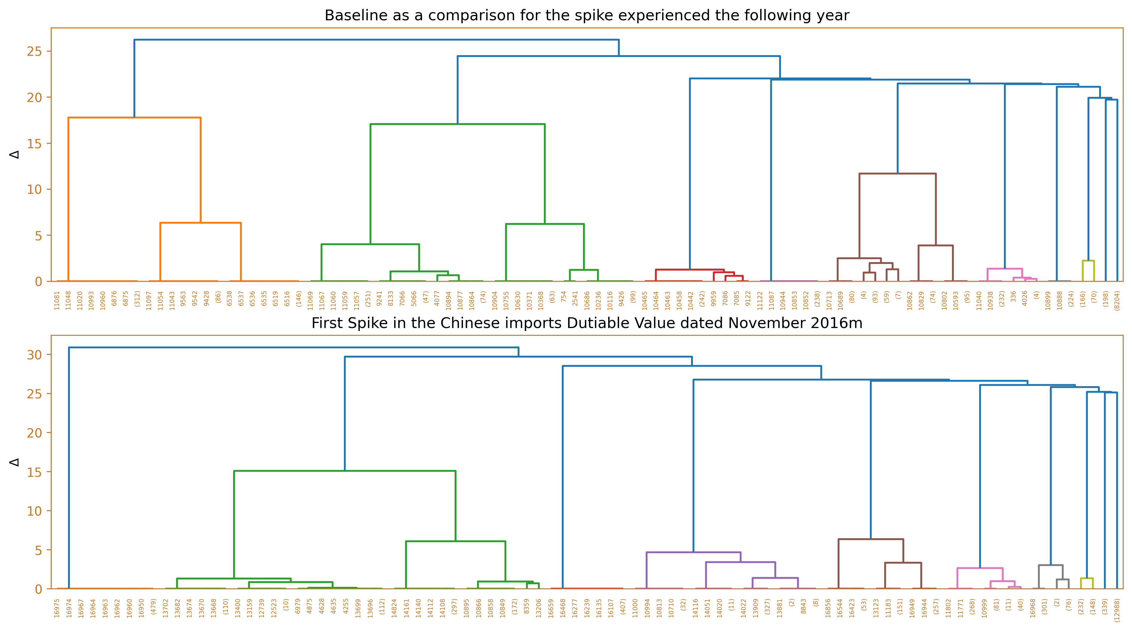
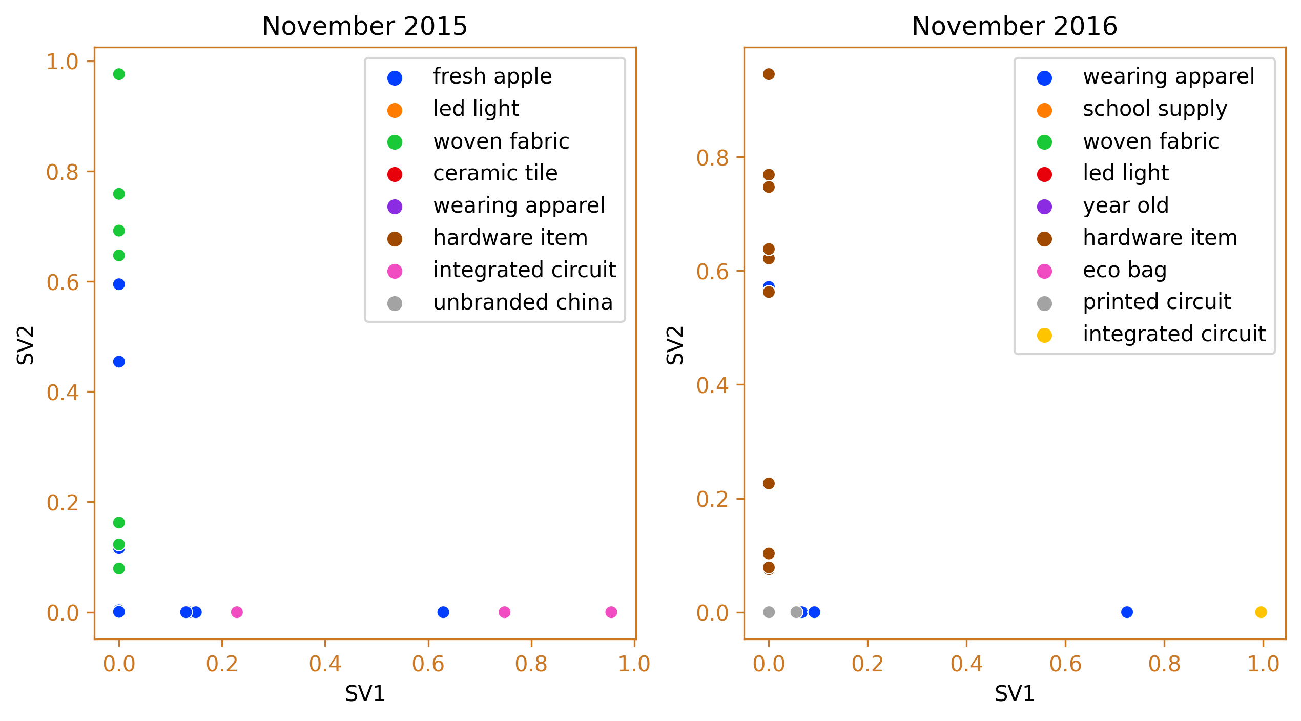
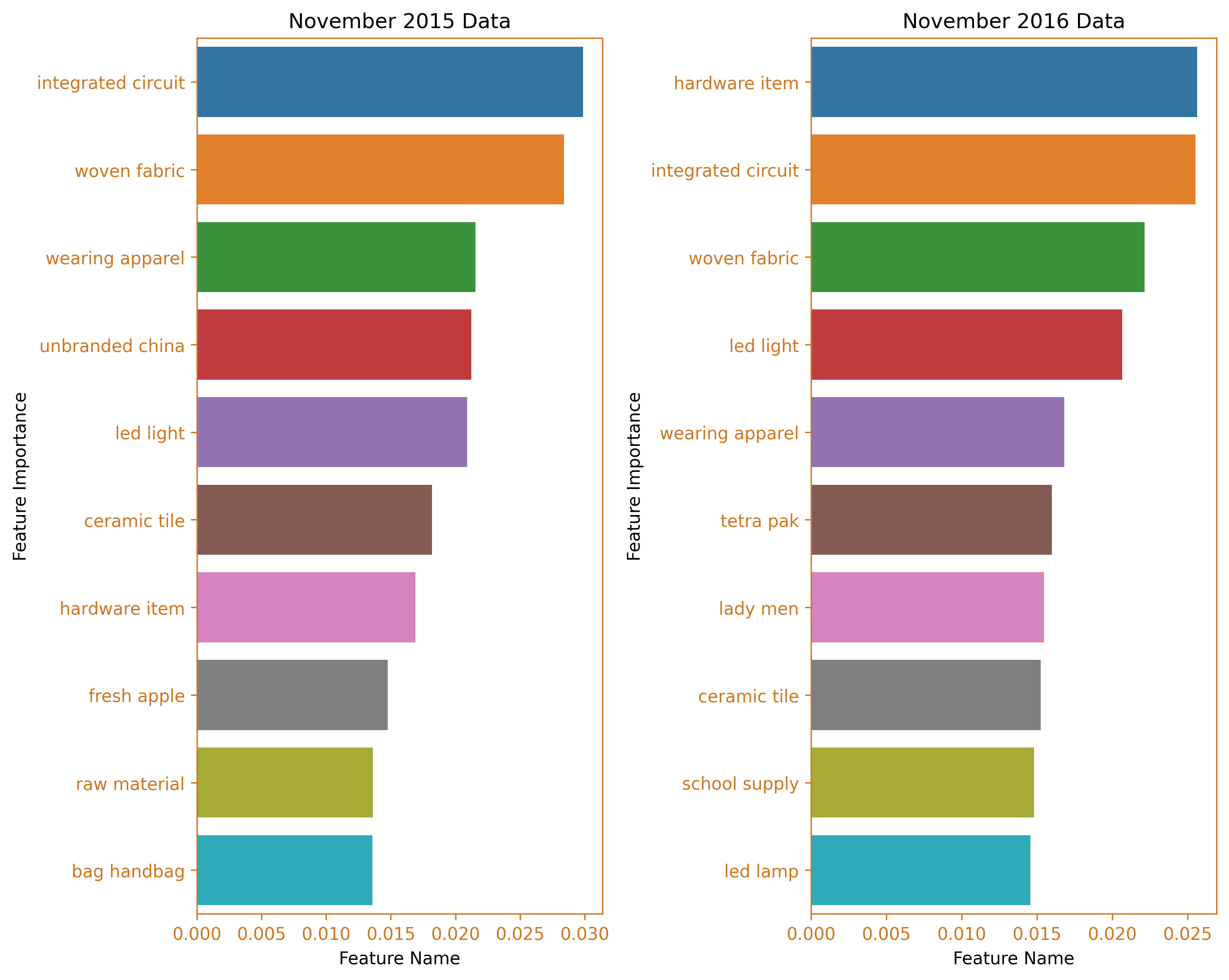
This section discusses the different months which exhibited surges in dutiable values yet have not triggered their corresponding increase in the number of duties and taxes. In order to dissect/describe these irregularities, the team used Ward’s method, a hierarchical clustering technique to cluster the imported goods, and compared it against a baseline from the same month, a year prior. Several diagrams will be used to illustrate these findings such as the use of horizontal bar charts, dendrograms, and word clouds.
First spike which occured on November 2016
# Load the two pickled files for 2016 and 2015
file1 = 'pickles/china_svd_new_2016-11.pkl'
file2 = 'pickles/df_data_2016-11.pkl'

with open(file1, 'rb') as f:
    china_svd_new = pickle.load(f)

with open(file2, 'rb') as f:
    df_data = pickle.load(f)

file3 = 'pickles/china_svd_new_2015-11.pkl'
file4 = 'pickles/df_data_2015-11.pkl'

with open(file3, 'rb') as f:
    china_svd_new_1 = pickle.load(f)

with open(file4, 'rb') as f:
    df_data_1 = pickle.load(f)

# Plot the dendrogram of the hierarchical clustering
df_china_dendo = linkage(china_svd_new, method='ward')
df_china_dendo_1 = linkage(china_svd_new_1, method='ward')

# Set up the plot with two subplots
fig, ax = plt.subplots(2, 1, figsize=(6.4*2, 1.8*4))
ax = ax.flatten()

# Plot the dendrogram for 2015 data
dendrogram(df_china_dendo_1, ax=ax[0], truncate_mode='level', p=8)

# Plot the dendrogram for 2016 data
dendrogram(df_china_dendo, ax=ax[1], truncate_mode='level', p=8)

fig.tight_layout(pad=2)

# Set the color of the plot elements
color = '#CC7722'

# Format the first subplot
ax[0].spines['bottom'].set_color(color)
ax[0].spines['top'].set_color(color)
ax[0].spines['right'].set_color(color)
ax[0].spines['left'].set_color(color)
ax[0].tick_params(axis='x', colors=color)
ax[0].tick_params(axis='y', colors=color)
ax[0].set_ylabel(r'$\Delta$')
ax[0].set_title('Baseline as a comparison for the spike experienced the following year')

# Format the second subplot
ax[1].spines['bottom'].set_color(color)
ax[1].spines['top'].set_color(color)
ax[1].spines['right'].set_color(color)
ax[1].spines['left'].set_color(color)
ax[1].tick_params(axis='x', colors=color)
ax[1].tick_params(axis='y', colors=color)
ax[1].set_ylabel(r'$\Delta$')
ax[1].set_title('First Spike in the Chinese imports Dutiable Value dated November 2016m')
plt.show()

fig_caption(f'Dendrogram', 'Comparison of 2015 and 2016')
# Initialize the AgglomerativeClustering model
agg = AgglomerativeClustering(n_clusters=None, linkage='ward', distance_threshold=25)

# Fit the model to the data
y_predict = agg.fit_predict(df_data)

# Create a dictionary to store the cluster labels
cluster_labels = {}

# For each unique cluster label, find the most frequent label in the cluster
for label in np.unique(y_predict):
    # Get the indices of the data points that belong to the cluster
    cluster_indices = np.where(y_predict == label)[0]

    # Find the most frequent label in the cluster
    most_frequent_label = df_data.iloc[cluster_indices].sum().sort_values(ascending=False).index[0]

    # Add the label to the dictionary
    cluster_labels[label] = most_frequent_label

# Create an array of the cluster labels
y_labels = np.array([cluster_labels[x] for x in y_predict])

# Initialize the AgglomerativeClustering model
agg_1 = AgglomerativeClustering(n_clusters=None, linkage='ward', distance_threshold=20)

# Fit the model to the data
y_predict_1 = agg_1.fit_predict(df_data_1)

# Create a dictionary to store the cluster labels
cluster_labels_1 = {}

# For each unique cluster label, find the most frequent label in the cluster
for label in np.unique(y_predict_1):
    # Get the indices of the data points that belong to the cluster
    cluster_indices = np.where(y_predict_1 == label)[0]

    # Find the most frequent label in the cluster
    most_frequent_label_1 = df_data_1.iloc[cluster_indices].sum().sort_values(ascending=False).index[0]

    # Add the label to the dictionary
    cluster_labels_1[label] = most_frequent_label_1

# Create an array of the cluster labels
y_labels_1 = np.array([cluster_labels_1[x] for x in y_predict_1])

# Plot the results using scatterplot
fig, ax = plt.subplots(1, 2, figsize=(10,5))
ax = ax.flatten()
sns.scatterplot(x=china_svd_new_1[:,0], y=china_svd_new_1[:,1], hue=y_labels_1, palette='bright', ax=ax[0])
sns.scatterplot(x=china_svd_new[:,0], y=china_svd_new[:,1], hue=y_labels, palette='bright', ax=ax[1])
ax[0].spines['bottom'].set_color(color)
ax[0].spines['top'].set_color(color)
ax[0].spines['right'].set_color(color)
ax[0].spines['left'].set_color(color)
ax[0].tick_params(axis='x', colors=color)
ax[0].tick_params(axis='y', colors=color)
ax[1].spines['bottom'].set_color(color)
ax[1].spines['top'].set_color(color)
ax[1].spines['right'].set_color(color)
ax[1].spines['left'].set_color(color)
ax[1].tick_params(axis='x', colors=color)
ax[1].tick_params(axis='y', colors=color)
ax[0].set_xlabel('SV1')
ax[0].set_ylabel('SV2')
ax[0].set_title('November 2015')
ax[1].set_xlabel('SV1')
ax[1].set_ylabel('SV2')
ax[1].set_title('November 2016')
plt.show()
fig_caption(f'Agglomerative Clustering', 'Comparison of 2015 and 2016')
# Get the feature importances by summing the number of samples in each cluster for each feature
importances = np.zeros(df_data.shape[1])
for label in np.unique(y_predict):
    cluster_indices = np.where(y_predict == label)[0]
    importances += df_data.iloc[cluster_indices].sum().values

# Normalize the feature importances
importances = importances / importances.sum()

# Get the feature names
feature_names = df_data.columns

# Sort the feature importances in descending order and get the top 10 features
top_features = np.argsort(importances)[::-1][:10]

barh_data = {'Feature Name': importances[top_features], 'Feature Importance': feature_names[top_features]}
barh_df = pd.DataFrame.from_dict(barh_data)

# Get the feature importances by summing the number of samples in each cluster for each feature
importances_1 = np.zeros(df_data_1.shape[1])
for label in np.unique(y_predict_1):
    cluster_indices_1 = np.where(y_predict_1 == label)[0]
    importances_1 += df_data_1.iloc[cluster_indices_1].sum().values

# Normalize the feature importances
importances_1 = importances_1 / importances_1.sum()

# Get the feature names
feature_names_1 = df_data_1.columns

# Sort the feature importances in descending order and get the top 10 features
top_features_1 = np.argsort(importances_1)[::-1][:10]

barh_data_1 = {'Feature Name': importances_1[top_features_1], 'Feature Importance': feature_names_1[top_features_1]}
barh_df_1 = pd.DataFrame.from_dict(barh_data_1)

fig, ax = plt.subplots(1, 2, figsize=(10, 8))
ax = ax.flatten()
sns.barplot(data=barh_df, x="Feature Name", y="Feature Importance", ax=ax[1])
sns.barplot(data=barh_df_1, x="Feature Name", y="Feature Importance", ax=ax[0])
ax[0].set_title('November 2015 Data')
ax[1].set_title('November 2016 Data')
ax[0].spines['bottom'].set_color(color)
ax[0].spines['top'].set_color(color)
ax[0].spines['right'].set_color(color)
ax[0].spines['left'].set_color(color)
ax[0].tick_params(axis='x', colors=color)
ax[0].tick_params(axis='y', colors=color)
ax[1].spines['bottom'].set_color(color)
ax[1].spines['top'].set_color(color)
ax[1].spines['right'].set_color(color)
ax[1].spines['left'].set_color(color)
ax[1].tick_params(axis='x', colors=color)
ax[1].tick_params(axis='y', colors=color)
plt.tight_layout()
plt.show()
fig_caption(f'Feature Importance BarH Plot', 'Comparison of 2015 and 2016')
# Define stopwords
stopwords = []

# Generate word cloud for November 2015
text = pd.Series(importances[::-1], index=feature_names[::-1])
mask = np.array(Image.open("cargo8.png"))
wordcloud = WordCloud(mask=mask,
                      background_color='white',
                      contour_width=2,
                      contour_color='orange',
                      stopwords=stopwords).generate_from_frequencies(text)

# Generate word cloud for November 2016
text_1 = pd.Series(importances_1[::-1], index=feature_names_1[::-1])
wordcloud1 = WordCloud(mask=mask,
                       background_color='white',
                       contour_width=2,
                       contour_color='orange',
                       stopwords=stopwords).generate_from_frequencies(text_1)

# Plot the word clouds in a figure
fig, ax = plt.subplots(1, 2, figsize=(10, 8))
ax = ax.flatten()
ax[0].imshow(wordcloud1)
ax[1].imshow(wordcloud)

# Remove the axis spines
for i in range(2):
    ax[i].spines['bottom'].set_visible(False)
    ax[i].spines['top'].set_visible(False)
    ax[i].spines['right'].set_visible(False)
    ax[i].spines['left'].set_visible(False)
    ax[i].set_xticks([])
    ax[i].set_yticks([])

# Add the titles for the word clouds
ax[0].set_title('November 2015')
ax[1].set_title('November 2016')

plt.tight_layout()
plt.show()

# Add the figure caption
fig_caption(f'WordCloud', 'Comparison of 2015 and 2016')
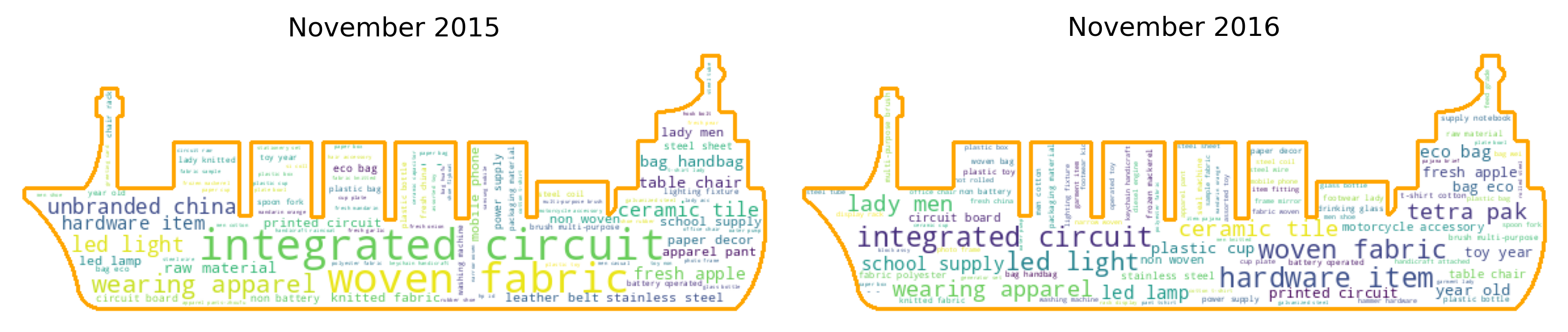
The first spike in dutiable value occurred in November 2016 and the clusters show that hardware items and electronic items dominated the goods imported from China during this month. This clustering is better than using the HS Code to group the goods. The specific HS code for hardware items can vary widely depending on the type of hardware and its specific use. For example, the HS code for door locks might be 83.06, while the HS code for hand tools might be 82.05. With this clustering, the large variety in goods can be reduced and similar items combined together. Taking the previous year’s cluster of goods for the same month, we can see a significant difference. There were more integrated circuit, fabric and apparel that were imported from China and less hardware items traded.
Second spike which occured on July 2017
# Load the two pickled files for 2016 and 2015
file1 = 'pickles/china_svd_new_2017-7.pkl'
file2 = 'pickles/df_data_2017-7.pkl'
with open(file1, 'rb') as f:
china_svd_new = pickle.load(f)
with open(file2, 'rb') as f:
df_data = pickle.load(f)
file3 = 'pickles/china_svd_new_2016-7.pkl'
file4 = 'pickles/df_data_2016-7.pkl'
with open(file3, 'rb') as f:
china_svd_new_1 = pickle.load(f)
with open(file4, 'rb') as f:
df_data_1 = pickle.load(f)
# Plot the dendrogram of the hierarchical clustering
df_china_dendo = linkage(china_svd_new, method='ward')
df_china_dendo_1 = linkage(china_svd_new_1, method='ward')
# Set up the plot with two subplots
fig, ax = plt.subplots(2, 1, figsize=(6.4*2, 1.8*4))
ax = ax.flatten()
# Plot the dendrogram for 2015 data
dendrogram(df_china_dendo_1, ax=ax[0], truncate_mode='level', p=8)
# Plot the dendrogram for 2016 data
dendrogram(df_china_dendo, ax=ax[1], truncate_mode='level', p=8)
fig.tight_layout(pad=2)
# Set the color of the plot elements
color = '#CC7722'
# Format the first subplot
ax[0].spines['bottom'].set_color(color)
ax[0].spines['top'].set_color(color)
ax[0].spines['right'].set_color(color)
ax[0].spines['left'].set_color(color)
ax[0].tick_params(axis='x', colors=color)
ax[0].tick_params(axis='y', colors=color)
ax[0].set_ylabel(r'$\Delta$')
ax[0].set_title('Baseline as a comparison for the spike experienced the following year')
# Format the second subplot
ax[1].spines['bottom'].set_color(color)
ax[1].spines['top'].set_color(color)
ax[1].spines['right'].set_color(color)
ax[1].spines['left'].set_color(color)
ax[1].tick_params(axis='x', colors=color)
ax[1].tick_params(axis='y', colors=color)
ax[1].set_ylabel(r'$\Delta$')
ax[1].set_title('Second Spike in the Chinese imports Dutiable Value dated July 2017')
plt.show()
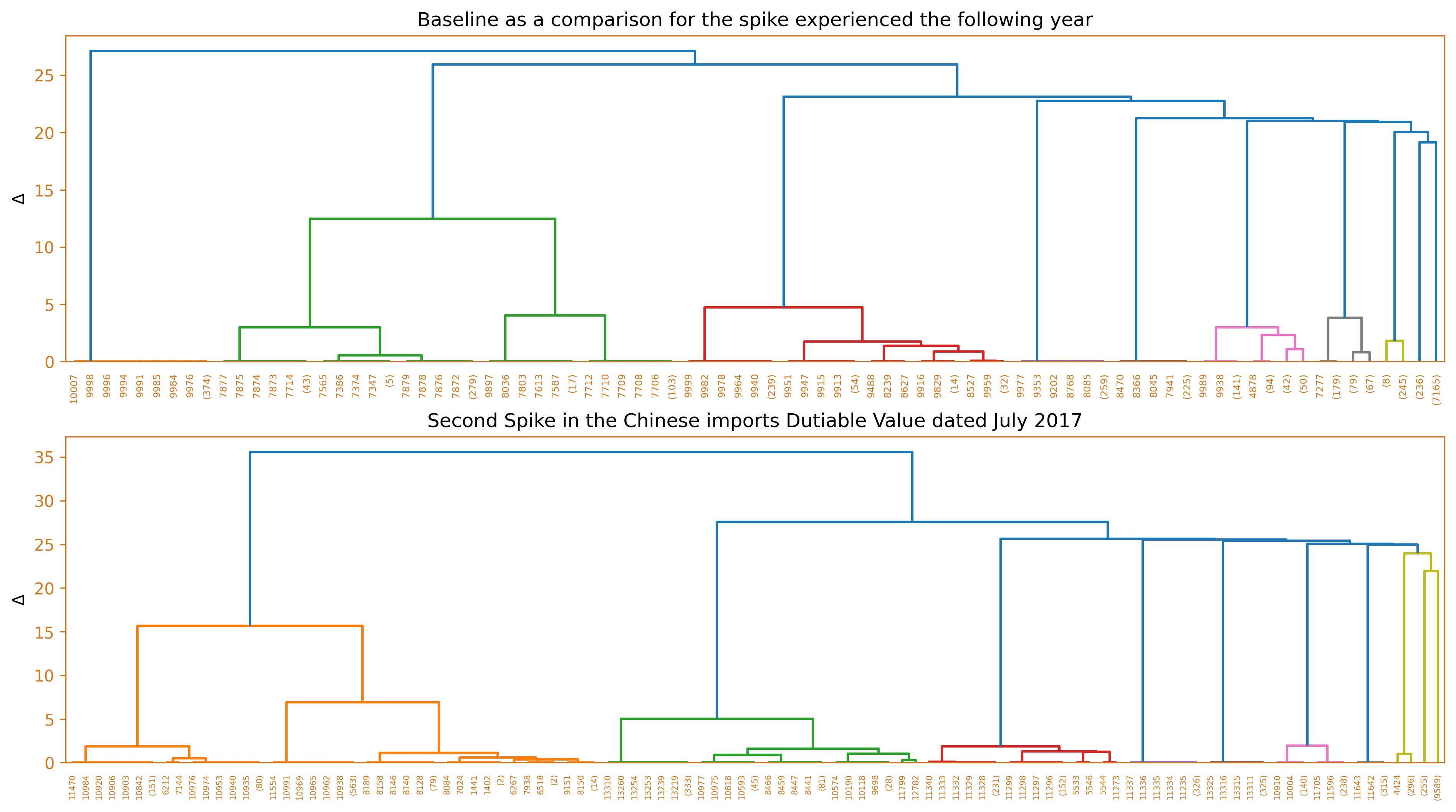
fig_caption(f'Dendrogram', 'Comparison of 2016 and 2017')
# Import the required libraries
import numpy as np
import seaborn as sns
import matplotlib.pyplot as plt
from sklearn.cluster import AgglomerativeClustering
# Initialize the AgglomerativeClustering model
agg = AgglomerativeClustering(n_clusters=None, linkage='ward', distance_threshold=25)
# Fit the model to the data
y_predict = agg.fit_predict(df_data)
# Create a dictionary to store the cluster labels
cluster_labels = {}
# For each unique cluster label, find the most frequent label in the cluster
for label in np.unique(y_predict):
# Get the indices of the data points that belong to the cluster
cluster_indices = np.where(y_predict == label)[0]
# Find the most frequent label in the cluster
most_frequent_label = df_data.iloc[cluster_indices].sum().sort_values(ascending=False).index[0]
# Add the label to the dictionary
cluster_labels[label] = most_frequent_label
# Create an array of the cluster labels
y_labels = np.array([cluster_labels[x] for x in y_predict])
# Initialize the AgglomerativeClustering model
agg_1 = AgglomerativeClustering(n_clusters=None, linkage='ward', distance_threshold=20)
# Fit the model to the data
y_predict_1 = agg_1.fit_predict(df_data_1)
# Create a dictionary to store the cluster labels
cluster_labels_1 = {}
# For each unique cluster label, find the most frequent label in the cluster
for label in np.unique(y_predict_1):
# Get the indices of the data points that belong to the cluster
cluster_indices = np.where(y_predict_1 == label)[0]
# Find the most frequent label in the cluster
most_frequent_label_1 = df_data_1.iloc[cluster_indices].sum().sort_values(ascending=False).index[0]
# Add the label to the dictionary
cluster_labels_1[label] = most_frequent_label_1
# Create an array of the cluster labels
y_labels_1 = np.array([cluster_labels_1[x] for x in y_predict_1])
# Plot the results using scatterplot
fig, ax = plt.subplots(1, 2, figsize=(10,5))
ax = ax.flatten()
sns.scatterplot(x=china_svd_new_1[:,0], y=china_svd_new_1[:,1], hue=y_labels_1, palette='bright', ax=ax[0])
sns.scatterplot(x=china_svd_new[:,0], y=china_svd_new[:,1], hue=y_labels, palette='bright', ax=ax[1])
ax[0].spines['bottom'].set_color(color)
ax[0].spines['top'].set_color(color)
ax[0].spines['right'].set_color(color)
ax[0].spines['left'].set_color(color)
ax[0].tick_params(axis='x', colors=color)
ax[0].tick_params(axis='y', colors=color)
ax[1].spines['bottom'].set_color(color)
ax[1].spines['top'].set_color(color)
ax[1].spines['right'].set_color(color)
ax[1].spines['left'].set_color(color)
ax[1].tick_params(axis='x', colors=color)
ax[1].tick_params(axis='y', colors=color)
ax[0].set_xlabel('SV1')
ax[0].set_ylabel('SV2')
ax[0].set_title('July 2016')
ax[1].set_xlabel('SV1')
ax[1].set_ylabel('SV2')
ax[1].set_title('July 2017')
plt.show()
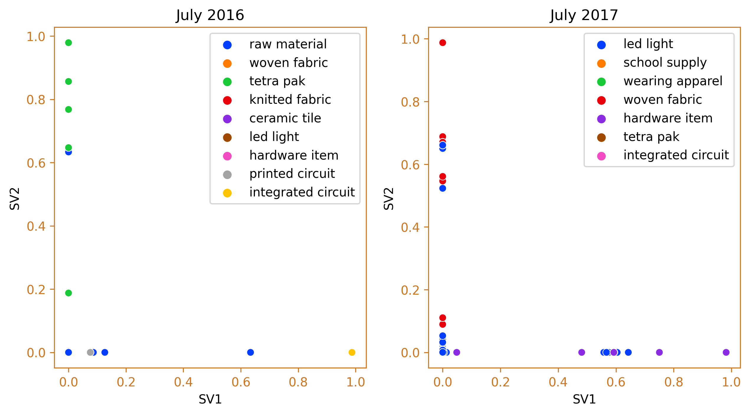
fig_caption(f'Agglomerative Clustering', 'Comparison of 2016 and 2017')
# Fit the Agglomerative Clustering model to the data
agg = AgglomerativeClustering(n_clusters=None, linkage='ward', distance_threshold = 25)
y_predict = agg.fit_predict(df_data)
# Get the feature importances by summing the number of samples in each cluster for each feature
importances = np.zeros(df_data.shape[1])
for label in np.unique(y_predict):
cluster_indices = np.where(y_predict == label)[0]
importances += df_data.iloc[cluster_indices].sum().values
# Normalize the feature importances
importances = importances / importances.sum()
# Get the feature names
feature_names = df_data.columns
# Sort the feature importances in descending order and get the top 10 features
top_features = np.argsort(importances)[::-1][:10]
barh_data = {'Feature Name': importances[top_features], 'Feature Importance': feature_names[top_features]}
barh_df = pd.DataFrame.from_dict(barh_data)
# Fit the Agglomerative Clustering model to the data
agg_1 = AgglomerativeClustering(n_clusters=None, linkage='ward', distance_threshold = 25)
y_predict_1 = agg_1.fit_predict(df_data_1)
# Get the feature importances by summing the number of samples in each cluster for each feature
importances_1 = np.zeros(df_data_1.shape[1])
for label in np.unique(y_predict_1):
cluster_indices_1 = np.where(y_predict_1 == label)[0]
importances_1 += df_data_1.iloc[cluster_indices_1].sum().values
# Normalize the feature importances
importances_1 = importances_1 / importances_1.sum()
# Get the feature names
feature_names_1 = df_data_1.columns
# Sort the feature importances in descending order and get the top 10 features
top_features_1 = np.argsort(importances_1)[::-1][:10]
barh_data_1 = {'Feature Name': importances_1[top_features_1], 'Feature Importance': feature_names_1[top_features_1]}
barh_df_1 = pd.DataFrame.from_dict(barh_data_1)
fig, ax = plt.subplots(1, 2, figsize=(10, 8))
ax = ax.flatten()
sns.barplot(data=barh_df, x="Feature Name", y="Feature Importance", ax=ax[1])
sns.barplot(data=barh_df_1, x="Feature Name", y="Feature Importance", ax=ax[0])
ax[0].set_title('July 2016 Data')
ax[1].set_title('July 2017 Data')
ax[0].spines['bottom'].set_color(color)
ax[0].spines['top'].set_color(color)
ax[0].spines['right'].set_color(color)
ax[0].spines['left'].set_color(color)
ax[0].tick_params(axis='x', colors=color)
ax[0].tick_params(axis='y', colors=color)
ax[1].spines['bottom'].set_color(color)
ax[1].spines['top'].set_color(color)
ax[1].spines['right'].set_color(color)
ax[1].spines['left'].set_color(color)
ax[1].tick_params(axis='x', colors=color)
ax[1].tick_params(axis='y', colors=color)
plt.tight_layout()
plt.show()
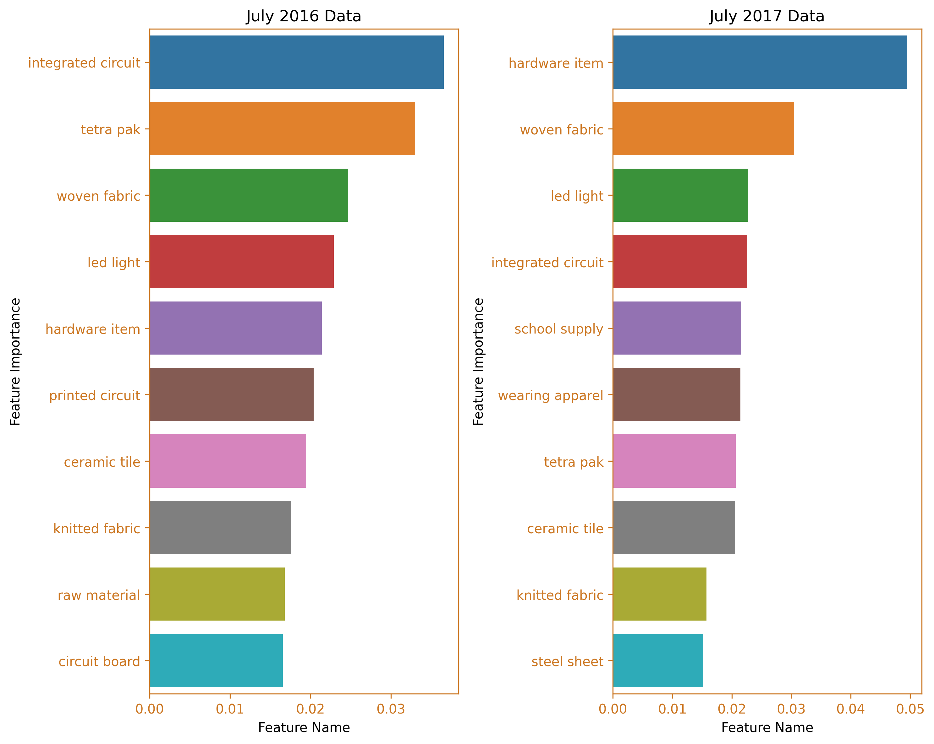
fig_caption(f'Feature Importance BarH Plot', 'Comparison of 2016 and 2017')
# Define stopwords
stopwords = []

# Generate word cloud for July 2016
text = pd.Series(importances[::-1], index=feature_names[::-1])
mask = np.array(Image.open("cargo8.png"))
wordcloud = WordCloud(mask=mask,
                      background_color='white',
                      contour_width=2,
                      contour_color='orange',
                      stopwords=stopwords).generate_from_frequencies(text)

# Generate word cloud for July 2017
text_1 = pd.Series(importances_1[::-1], index=feature_names_1[::-1])
wordcloud1 = WordCloud(mask=mask,
                       background_color='white',
                       contour_width=2,
                       contour_color='orange',
                       stopwords=stopwords).generate_from_frequencies(text_1)

# Plot the word clouds in a figure
fig, ax = plt.subplots(1, 2, figsize=(10, 8))
ax = ax.flatten()
ax[0].imshow(wordcloud1)
ax[1].imshow(wordcloud)

# Remove the axis spines
for i in range(2):
    ax[i].spines['bottom'].set_visible(False)
    ax[i].spines['top'].set_visible(False)
    ax[i].spines['right'].set_visible(False)
    ax[i].spines['left'].set_visible(False)
    ax[i].set_xticks([])
    ax[i].set_yticks([])

# Add the titles for the word clouds
ax[0].set_title('July 2016')
ax[1].set_title('July 2017')

plt.tight_layout()
plt.show()

# Add the figure caption
fig_caption(f'WordCloud', 'Comparison of 2016 and 2017')
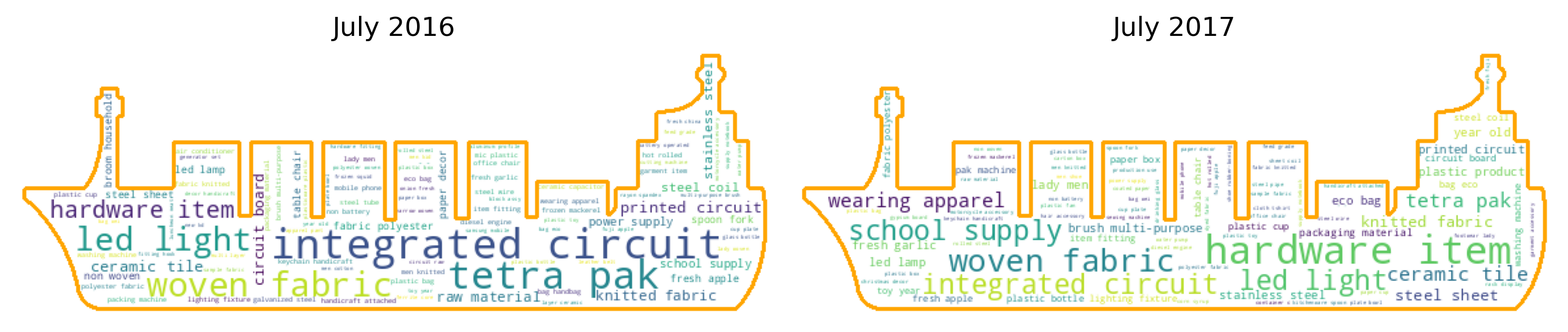
In July 2017, a second spike was observed. The data reveals that hardware items and woven fabric were the main products imported from China, while integrated circuits made a smaller contribution. This is a significant shift from the import situation in July 2016, where integrated circuits were the top imported items and tetra pak machines and spare parts were the second highest.
Third spike which occured on March 2019
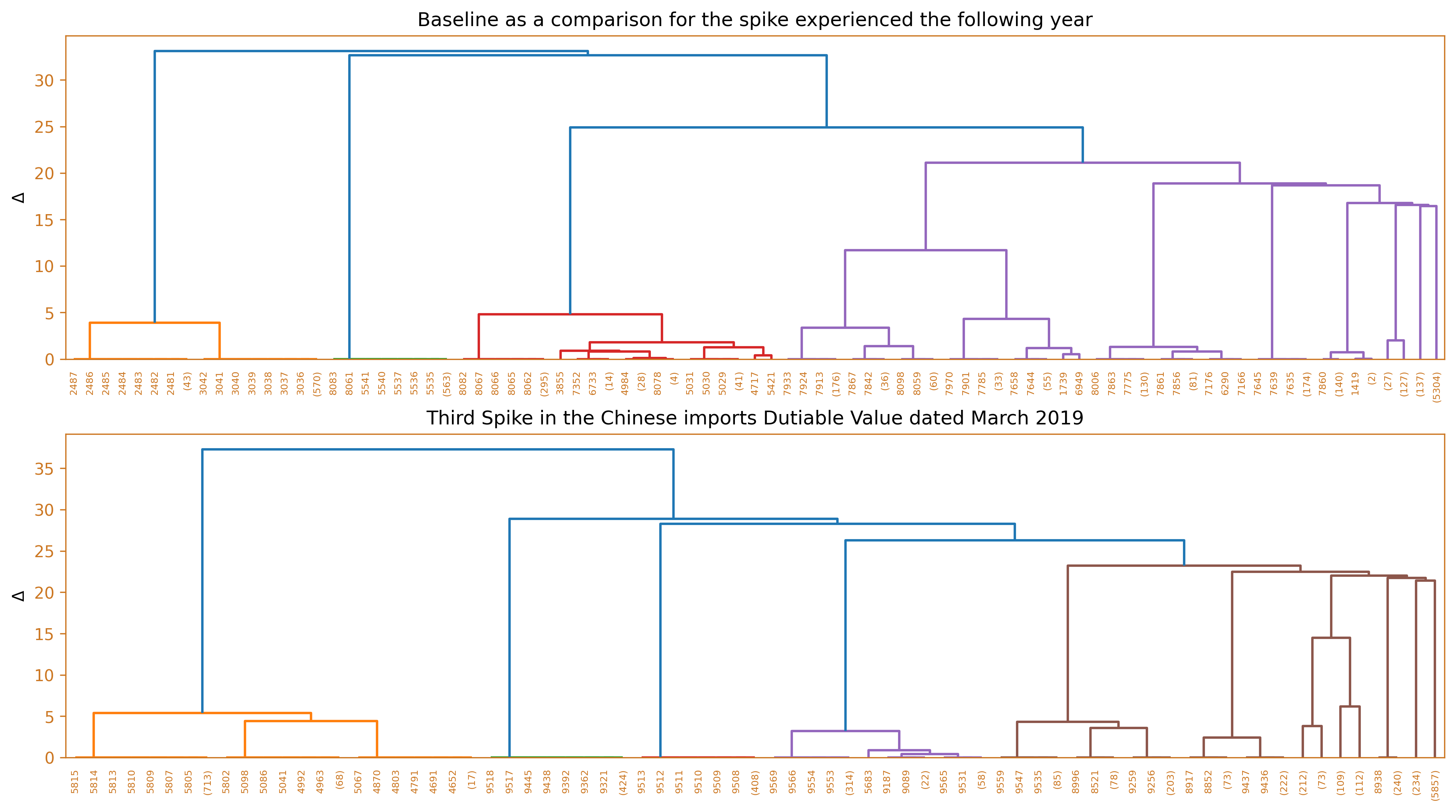
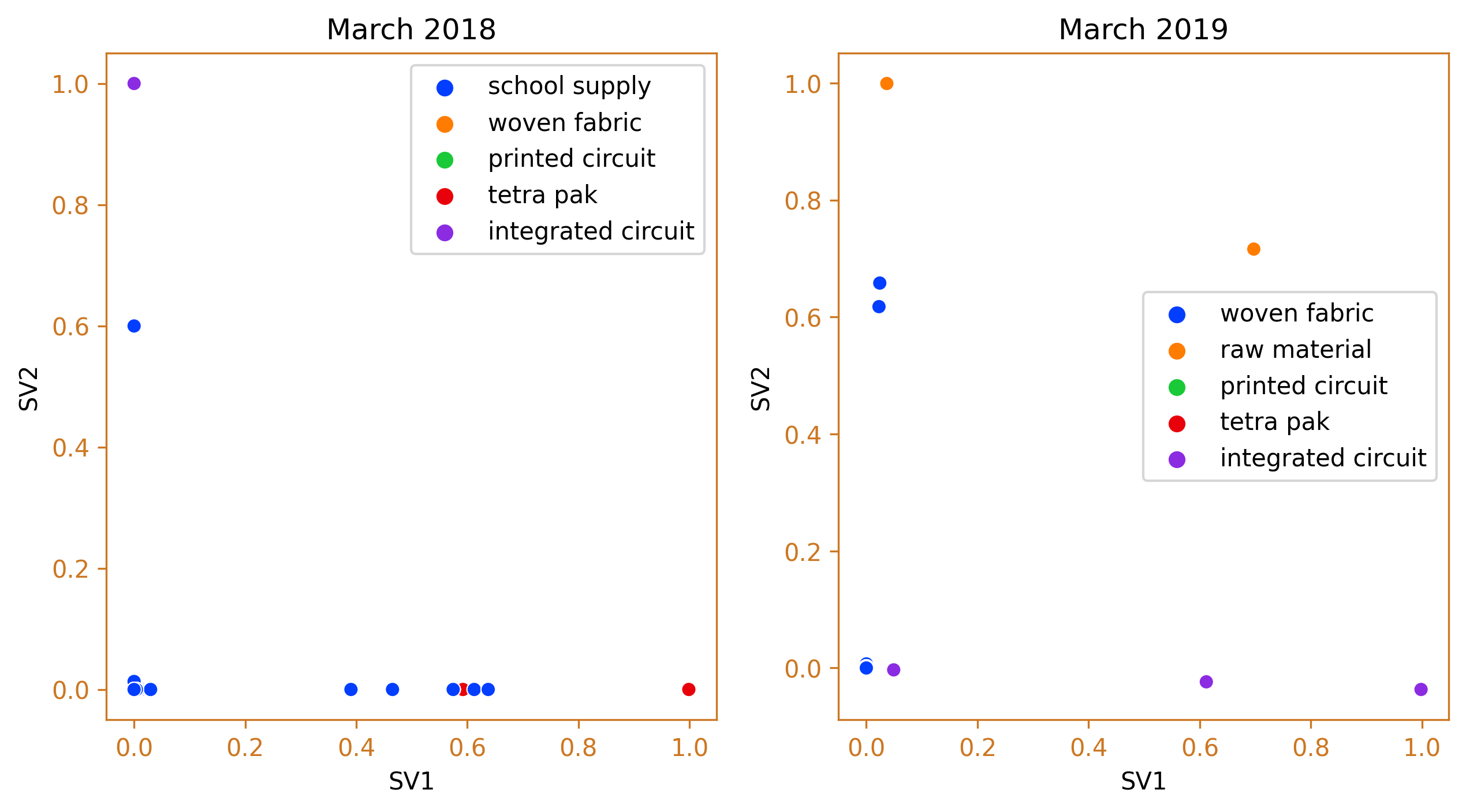
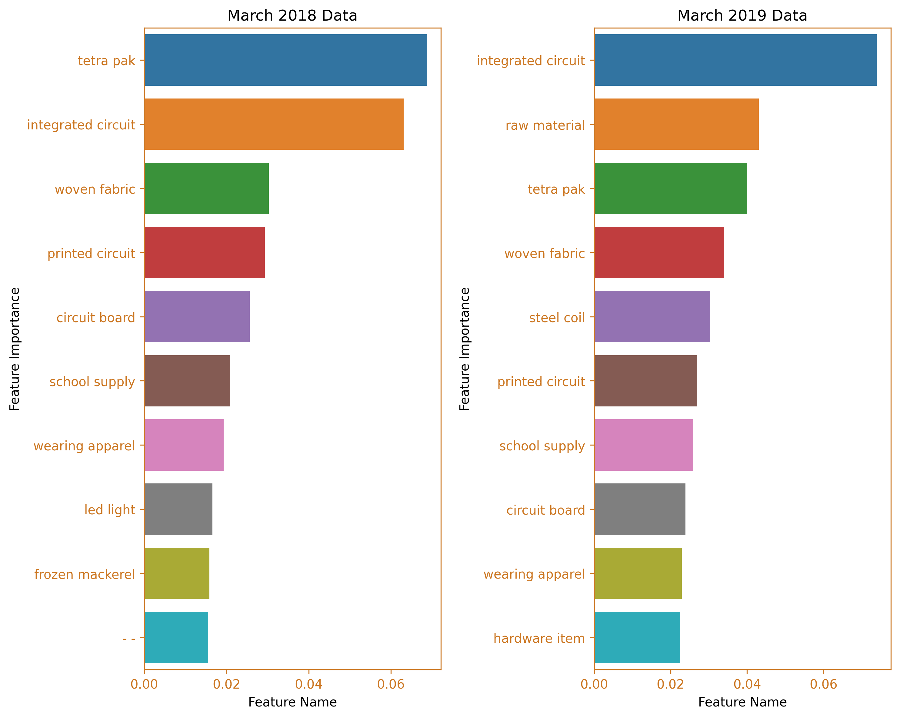
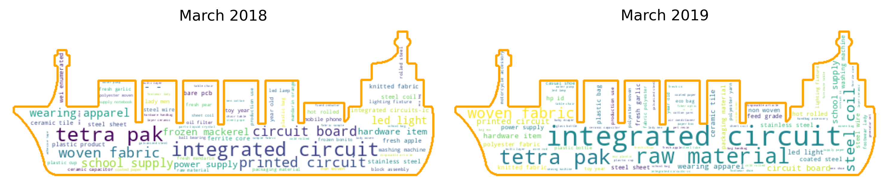
In March 2019, the third largest increase in the value of taxable goods was recorded. The leading imported products from China were again integrated circuits, followed by raw materials, tetra pak machines, and woven fabric. This is a contrast to the import scenario in March of the previous year, where the tetra pak cluster dominated, with integrated circuits being the second largest cluster.
Fourth spike which occured on July 2020
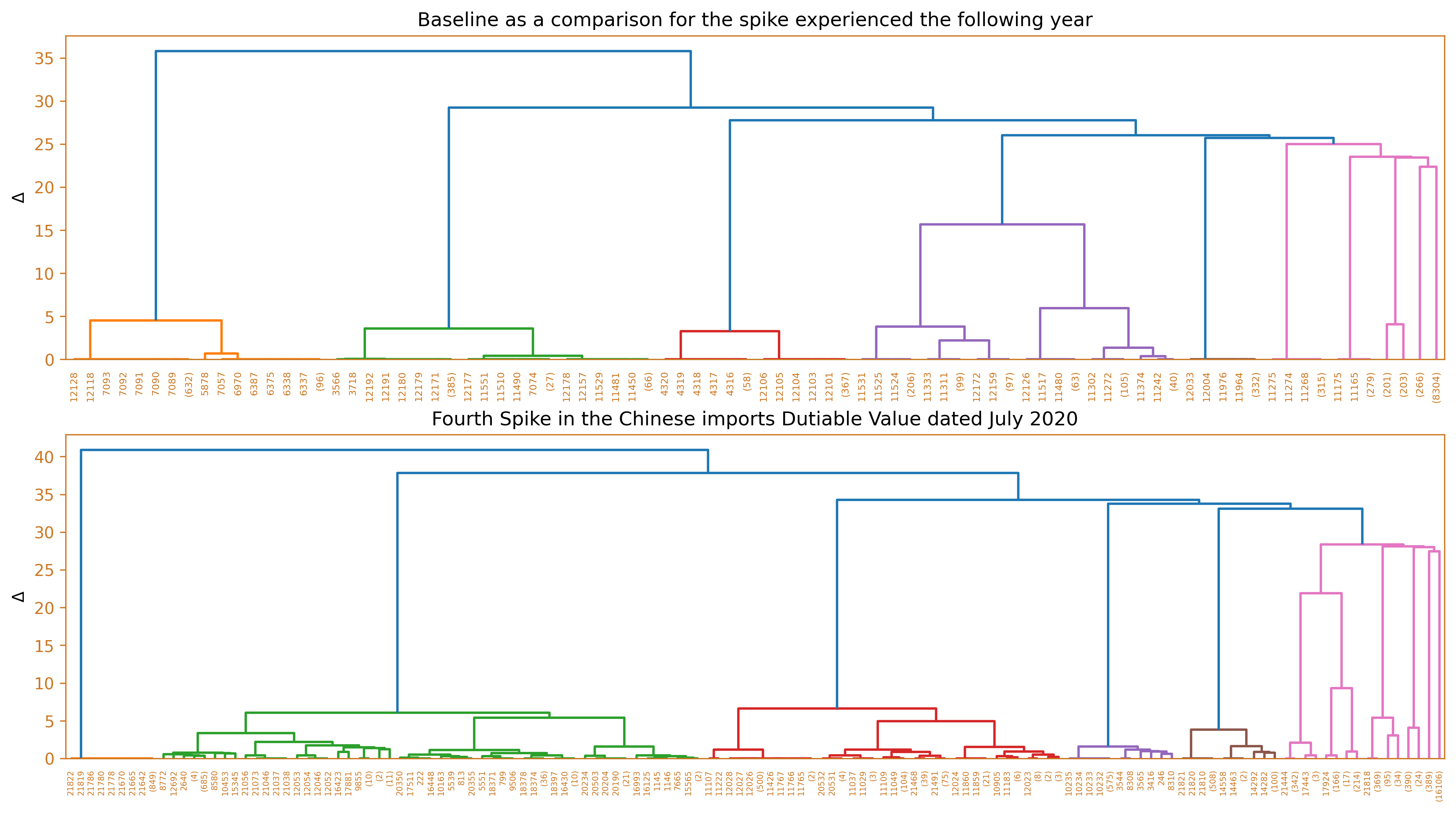
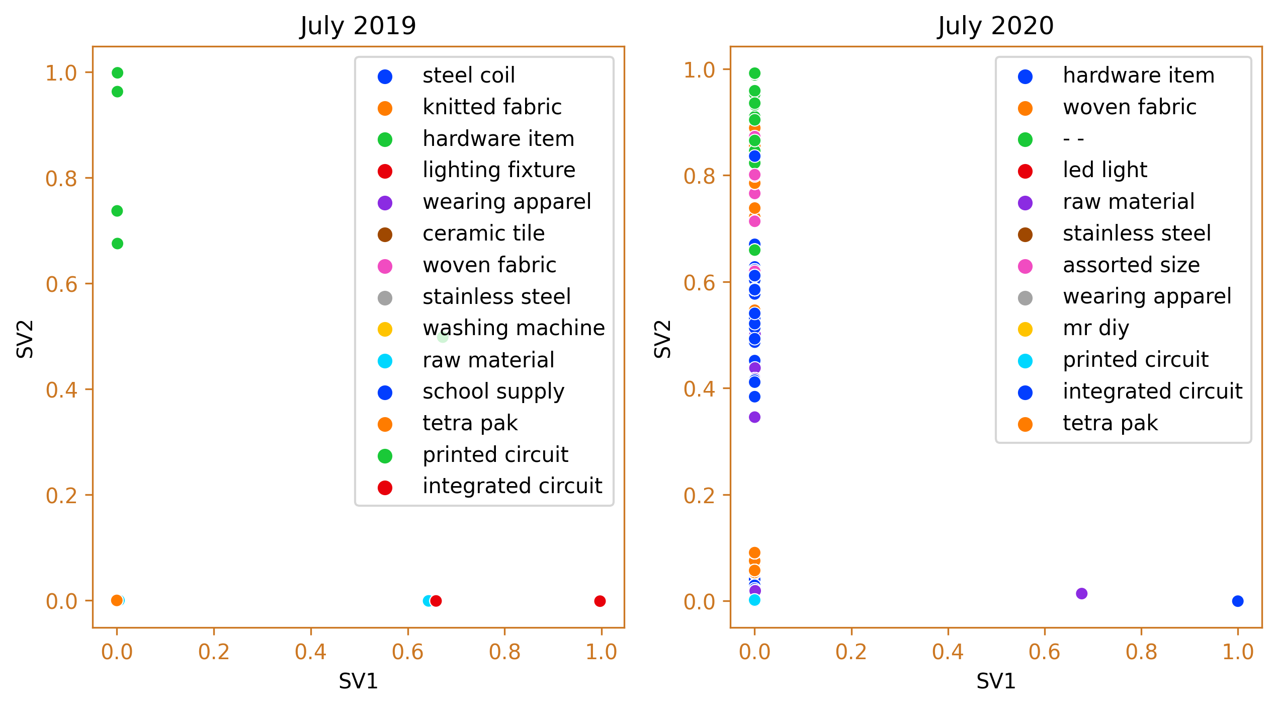
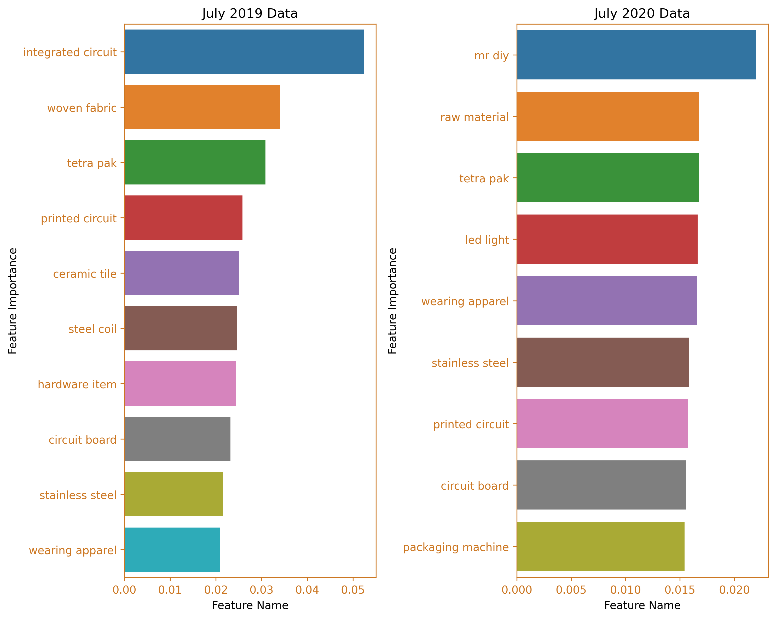
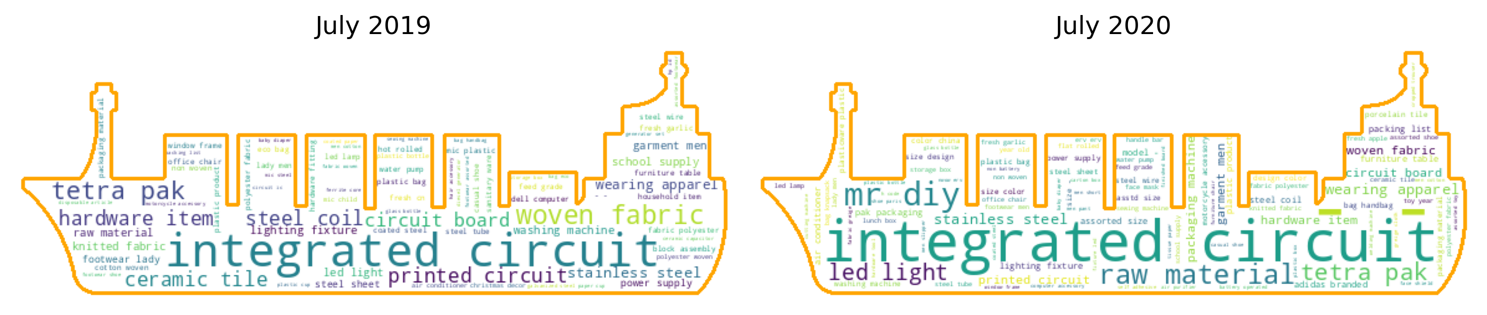
The highest peak in the value of taxable goods was recorded in July 2020, during the implementation of the least restrictive lockdown measures, General Community Quarantine (GCQ). The top two clusters were comprised of integrated circuits and the Mr. DIY cluster, which is a noteworthy cluster as it does not fit into any specific category within the tariff classification handbook. This is an issue that the Bureau of Customs (BOC) should examine. In contrast, during the same month the previous year, the leading clusters were still dominated by integrated circuits, followed by woven fabric and tetra pak machines.
Conclusion
In conclusion, our analysis of total dutiable values and duties and taxes paid highlights China’s remarkable performance among other nations. During the four-month period, the imported goods were efficiently grouped into fewer than 15 clusters through the application of agglomerative clustering. This parsimonious solution was achieved despite the thousands of goods with differing descriptions, reflecting the efficacy of the methodology employed. The first two peaks were dominated by hardware items, while raw materials emerged as the dominant import in the Philippine market during the third peak. The fourth peak was characterized by a significant proportion of imported goods within the integrated circuit cluster. The use of agglomerative clustering was motivated by the existing categorization and taxation system of goods based on their sections and chapters. Our analysis demonstrates the potential of clustering techniques in streamlining the classification of imported goods, thereby facilitating the tax assessment process. The comprehensive methodology employed in this study, as well as the various clustering methods described in the appendix, provide valuable insights into the optimization of the import tax assessment process.
Recommendations
Recommendations for the BoC
Based on the findings of our analysis, it is recommended that the Bureau of Customs (BoC) consider the integration of innovative clustering techniques, such as agglomerative clustering, into their assessment process. The use of these techniques could potentially provide the BoC with a new and effective method for categorizing and examining various goods, supplementing or even replacing the traditional classification methods, such as sections and chapters. The utilization of clustering techniques, as demonstrated in our study, has the potential to greatly enhance the efficiency and accuracy of the import tax assessment process. By taking into account the distinct characteristics of different kinds of goods, clustering techniques can optimize the allocation of resources, thereby improving the overall effectiveness of the assessment process. It is imperative for the BoC to continuously seek new and innovative solutions that will enhance their operational efficiency and effectiveness in the ever-evolving global marketplace. The adoption of clustering techniques, as presented in this study, is a step towards realizing this goal.
Recommendations for further studies
The current study was limited in scope due to constraints such as time and computational resource limitations. As a result, only a limited dataset was analyzed. Further research is necessary to gain deeper insights and to broaden the understanding of the topic. This can be achieved by expanding the analysis to include data from different administration terms, different exporting countries, and different trade agreements, and by conducting comparative studies utilizing the obtained data. By doing so, the research will be able to provide more comprehensive insights and make more meaningful contributions to the field.
References
Department of Finance: Bureau of Customs. (n.d.). Briefing Room. Retrieved from https://www.officialgazette.gov.ph/section/briefing-room/department-of-finance/bureau-of-customs/
Bureau of Customs. (n.d.). Offices. Retrieved from https://customs.gov.ph/offices/
Bureau of Customs. (2022). BOC Accomplishments: Duterte Legacy 2016-2022 [PDF]. Retrieved from https://customs.gov.ph/wp-content/uploads/2022/11/BOC-Accomplishments-Duterte-Legacy-2016-2022.pdf
Bworld Online. (2022, July 26). New customs chief to crack down on smuggling. Retrieved from https://www.bworldonline.com/top-stories/2022/07/26/463515/new-customs-chief-to-crack-down-on-smuggling/
Appendix
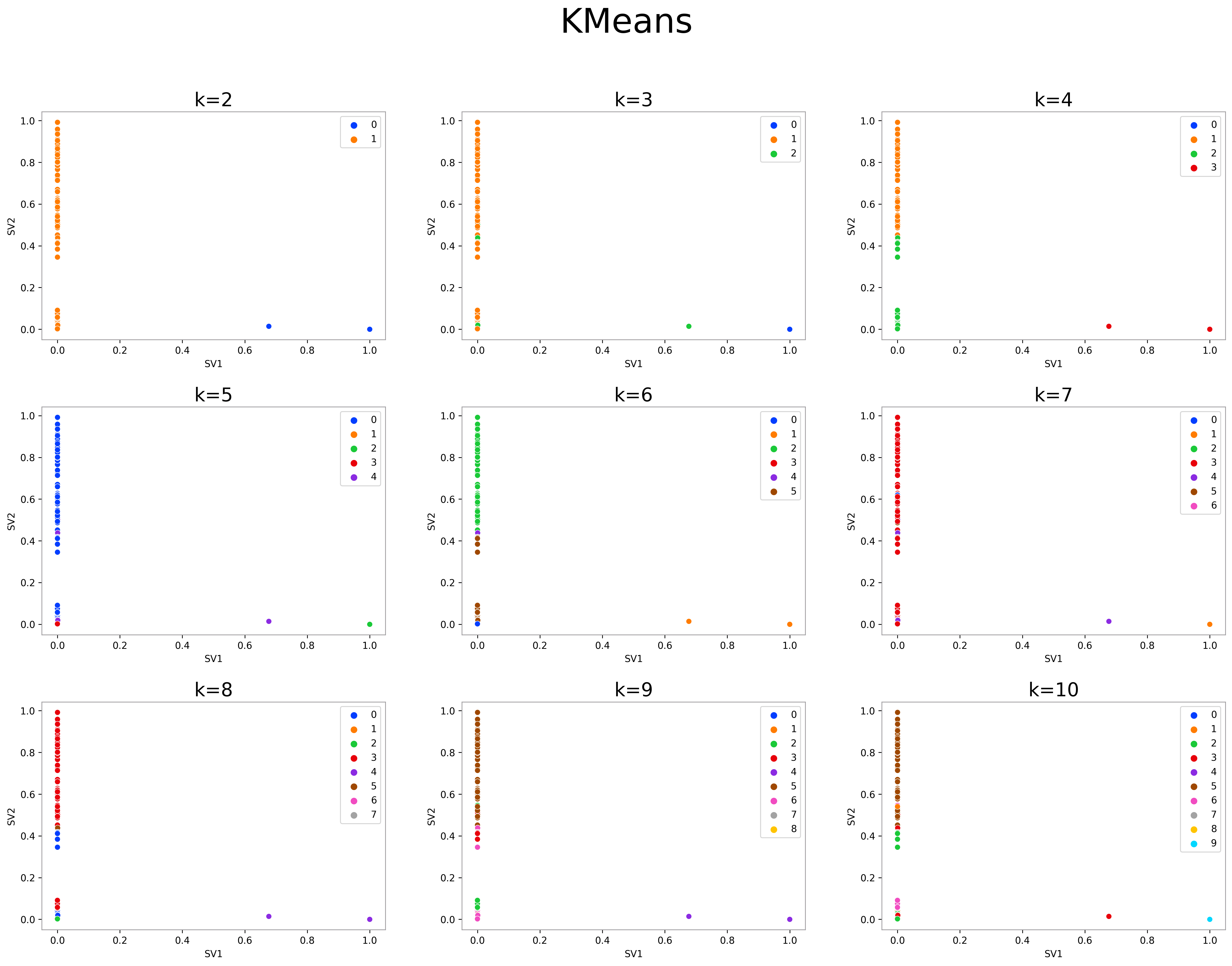
K-Means
from tqdm.notebook import tqdm, trange
fig, ax = plt.subplots(4, 3, figsize=(6.4*3, 4.8*4))
ax = ax.flatten()
fig.suptitle('KMeans', fontsize=36)
fig.tight_layout(pad=5)
fig.delaxes(ax[-1])
fig.delaxes(ax[-2])
fig.delaxes(ax[-3])
for k, ax in zip(trange(2, 11), ax):
    kmeans = KMeans(n_clusters=k, random_state=10053, n_init=10)
    y_predict = kmeans.fit_predict(china_svd_new)
    sns.scatterplot(x=china_svd_new[:, 0], y=china_svd_new[:, 1], ax=ax,
                       hue=kmeans.labels_, palette='bright', legend=True)
    ax.set_title(f'k={k}', fontsize=20)
    ax.set_xlabel('SV1')
    ax.set_ylabel('SV2')
    fig.show()
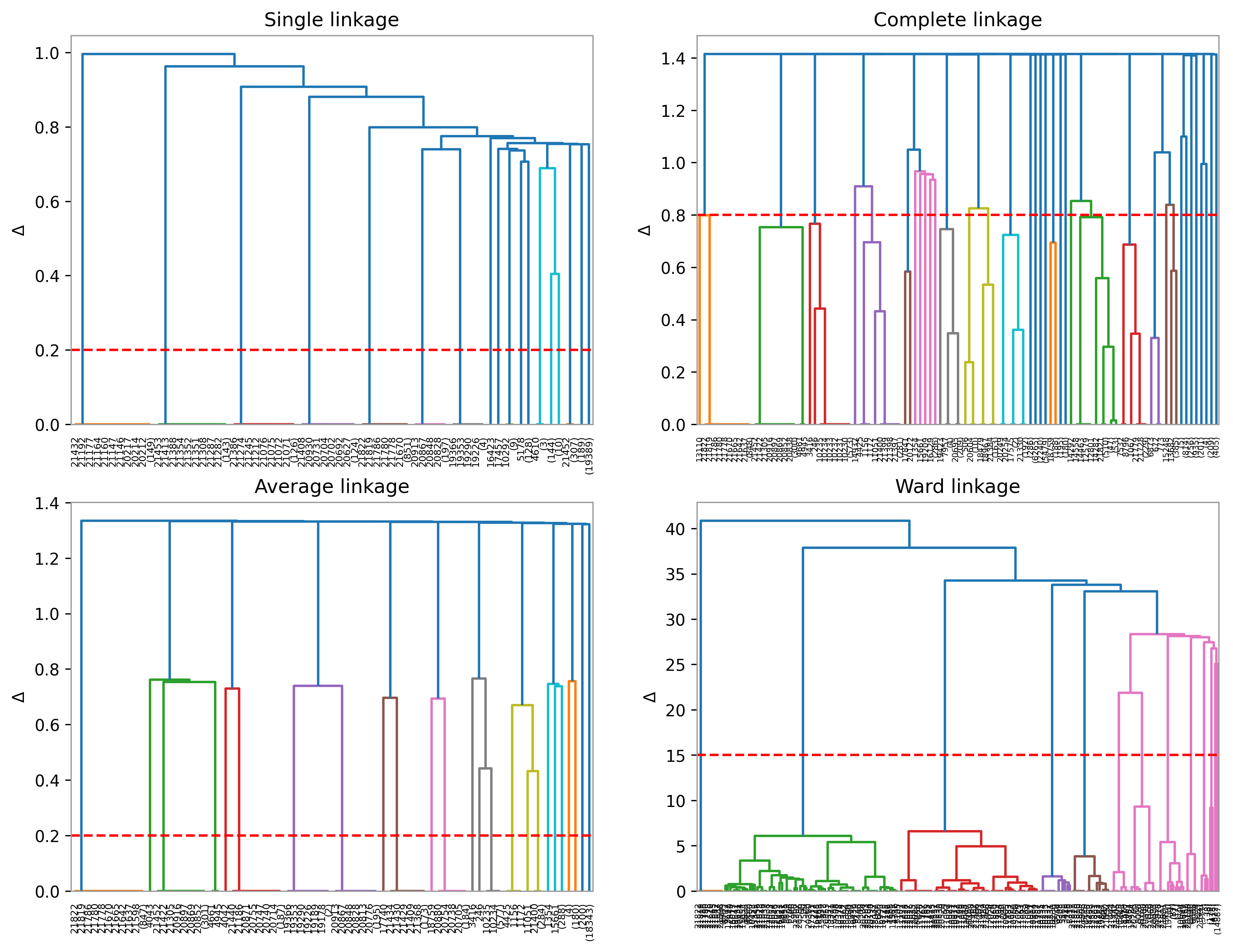
Hierarchical Clustering
links = ['single', 'complete', 'average', 'ward']
try:
    with open('pickles/Zs.pkl', 'rb') as f:
        Zs = joblib.load(f)
except:
    Zs = []
    for link in links:
        Zs.append(linkage(china_svd_new, method=link))
    with open('pickles/Zs.pkl', 'wb') as f:
        joblib.dump(Zs, f)
threshold_dict = dict(zip(links, [.2, .8, .2, 15]))
fig, ax = plt.subplots(2, 2, figsize=(6.4*2, 4.8*2))
ax = ax.flatten()
for i, (name, thresh) in enumerate(threshold_dict.items()):
    dendrogram(Zs[i], ax=ax[i], truncate_mode='level', p=10)
    ax[i].set_title(f'{links[i].title()} linkage')
    ax[i].axhline(y=thresh, color='r', linestyle='--')
    ax[i].set_ylabel('$\Delta$')
Density-based Spatial Clustering of Applications with Noise (DBSCAN)
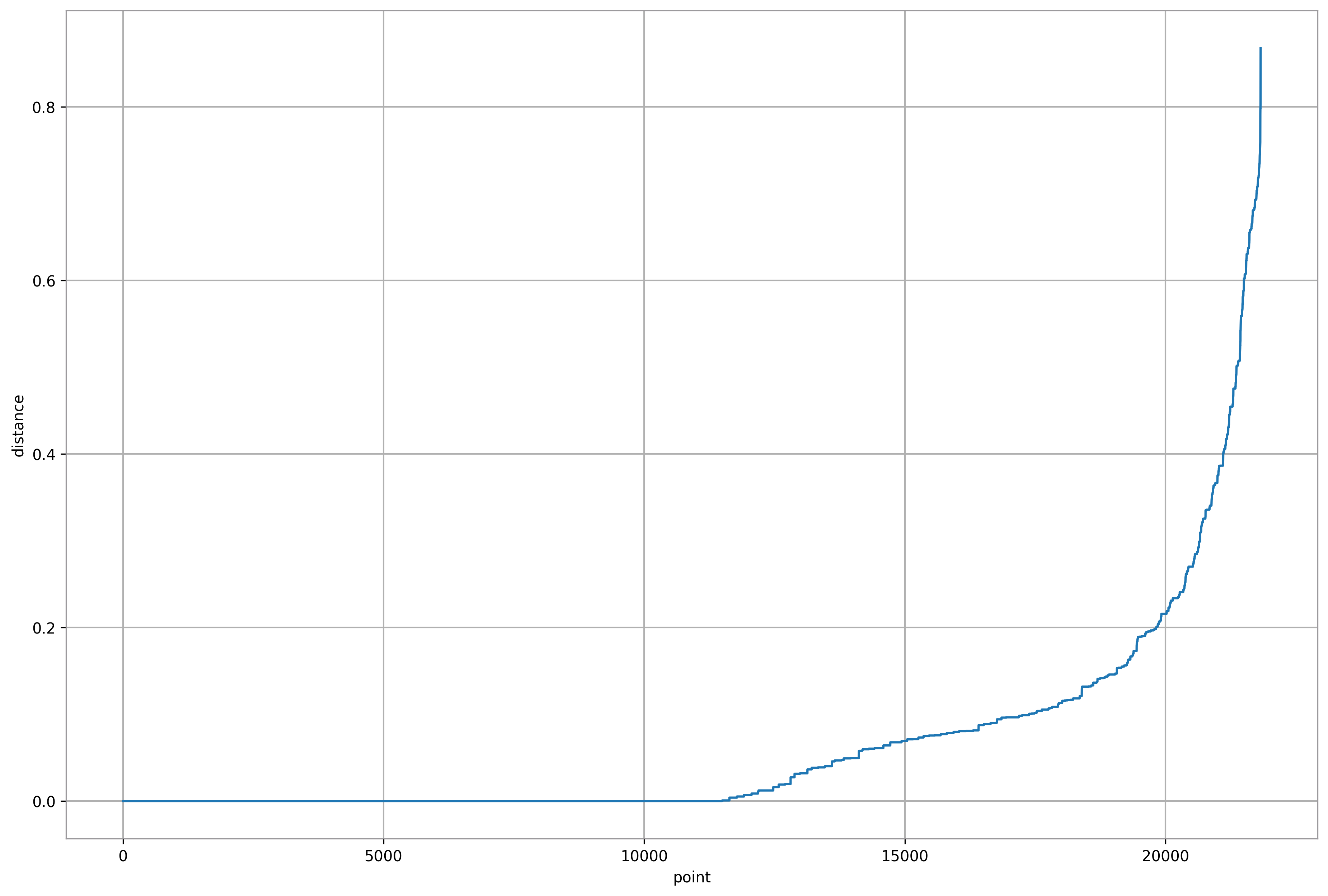
def ave_nn_dist(n_neighbors, data):
    """
    The function accepts the n_neighbors and the data. Returns the average
    distance of a point to its k =1 nearest neighbor up to k = n_neighbors
    nearest neighbor as a sorted list.
    """

    nn = NearestNeighbors(n_neighbors=n_neighbors).fit(data)
    dist = list(np.sort(nn.kneighbors()[0].mean(axis=1)))
    return dist

plt.plot(ave_nn_dist(china_svd_new.shape[1]*2, china_svd_new))
plt.xlabel('point')
plt.ylabel('distance')
plt.grid()
plt.show()
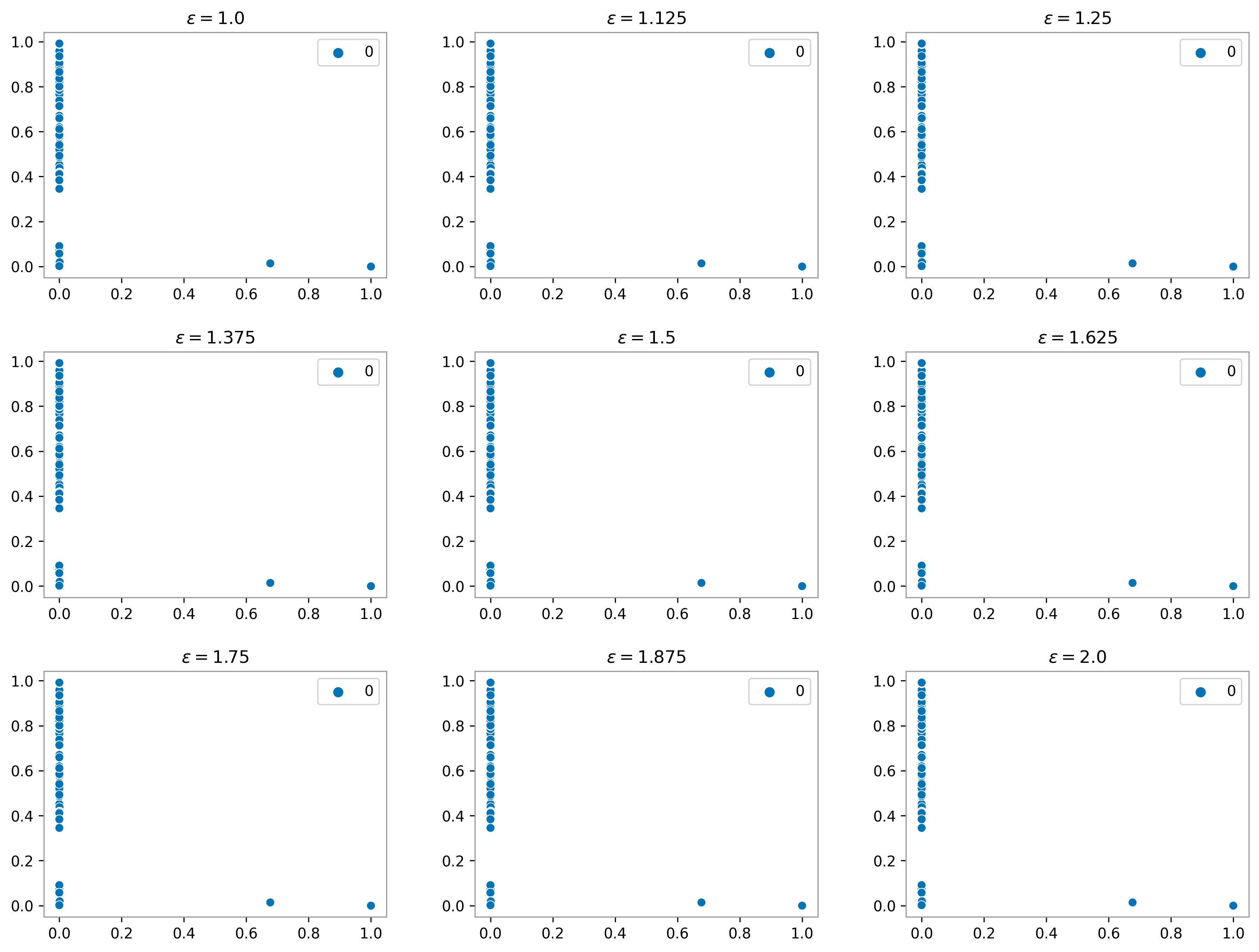
dbscan_dict = {}
for i, eps in enumerate(np.linspace(1.0, 2, 9)):
    dbscan = DBSCAN(eps=eps, min_samples=china_svd_new.shape[1], n_jobs=-1)
    cluster_labels = dbscan.fit_predict(china_svd_new)
    dbscan_dict.update({eps: (dbscan, cluster_labels)})
with open('pickles/dbscan_dict.pkl', 'wb') as f:
    joblib.dump(dbscan, f)

fig, axes = plt.subplots(3, 3, figsize=(6.4*2, 4.8*2))
fig.tight_layout(pad=3)
axes = axes.flatten()

for i, (eps, (dbscan, cluster_labels)) in enumerate(dbscan_dict.items()):
    sns.scatterplot(data=china_svd_new, x=china_svd_new[:,0], y=china_svd_new[:,1],
                    hue=cluster_labels,
                    ax=axes[i], palette='colorblind')
    axes[i].set_title(f'$\epsilon={eps}$')
Ordering Points to Identify the Clustering Structure (OPTICS)
optics = OPTICS(min_samples=china_svd_new.shape[1]*2, n_jobs=-1)
optics.fit(china_svd_new)
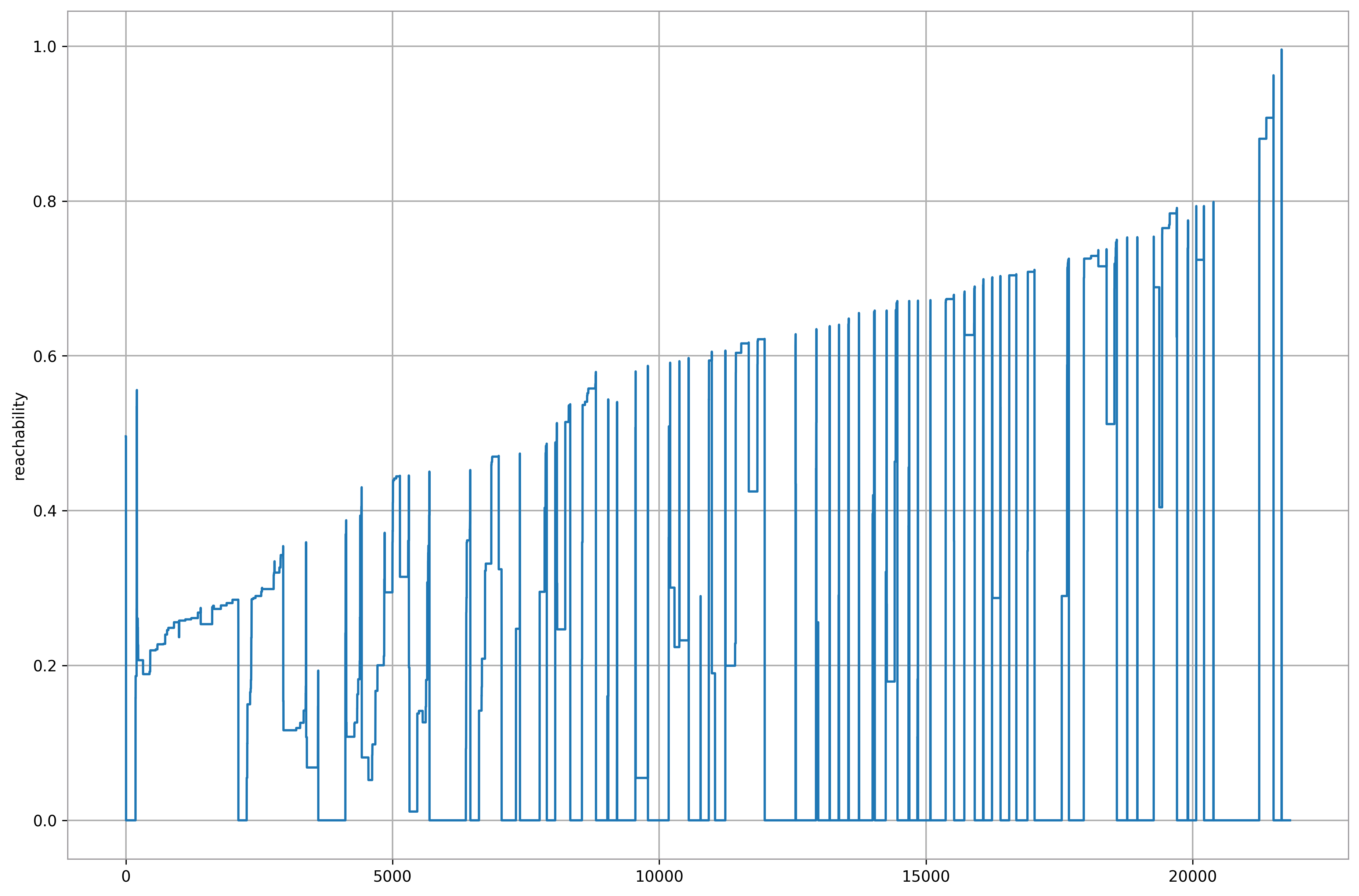
plt.plot(optics.reachability_[optics.ordering_])
plt.grid()
plt.ylabel('reachability');
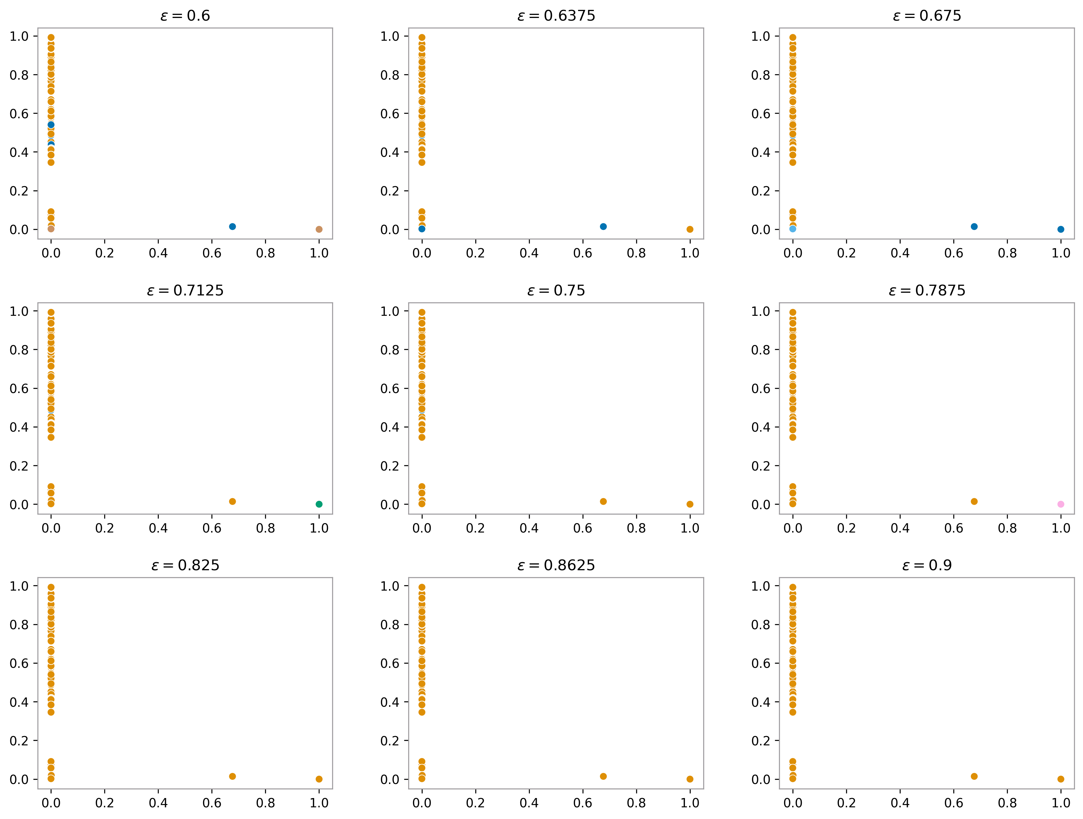
optics_dict = {}
for i, eps in enumerate(np.linspace(.6, .9, 9)):
    optics = OPTICS(min_samples=china_svd_new.shape[1]*2, n_jobs=-1)
    optics.fit(china_svd_new)
    cluster_labels = cluster_optics_dbscan(
    reachability=optics.reachability_,
    core_distances=optics.core_distances_,
    ordering=optics.ordering_,
    eps=eps
)
    optics_dict.update({eps: (optics, cluster_labels)})
with open('pickles/optics_dict.pkl', 'wb') as f:
    joblib.dump(optics, f)

fig, axes = plt.subplots(3, 3, figsize=(6.4*2, 4.8*2))
fig.tight_layout(pad=3)
axes = axes.flatten()

for i, (eps, (optics, cluster_labels)) in enumerate(optics_dict.items()):
    sns.scatterplot(data=china_svd_new, x=china_svd_new[:,0], y=china_svd_new[:,1],
                    hue=cluster_labels, legend=False,
                    ax=axes[i], palette='colorblind')
    axes[i].set_title(f'$\epsilon={eps}$')
ACKNOWLEDGEMENT
I completed this project with my Sub Learning Team, which consisted of Frances Divina Egango and Allan Geronimo.